Voluntree
A social platform that motivates people to volunteer in their communities
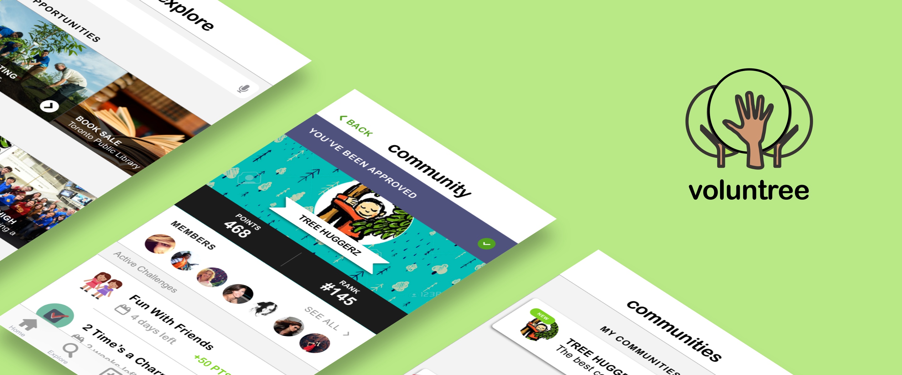

Back in 2017 I took a human factors interface design course where we were challenged to design a mobile application under the theme "social good". My team and I, all very actively involved students, thought it would be great to do something that encouraged active participation in the community.
We came up with Voluntree, a social volunteering platform that motivates people to volunteer through gamification and social sharing. Inter-community challenges give users a fun way to track their contributions, support social causes, and share their experiences with friends and family.
Product Designer
Sept 2017 - Dec 2017
Sketch, Axure RP, InVision
Ryan Cheng, Meggie Debnath, Smiriti Shankar, Lauren Ip (Me!)
In a survey done by Statistics Canada (2010), it was shown that less than half of the Canadian population over the age of 15 did volunteer work, and that most of the work was actually done by a small proportion of volunteers.
For the majority of young adults, the greatest barrier to volunteering regularly is a lack of time and availability. But in a world where there is never really enough "time", and people seem to be constantly busy no matter what they do, it all comes down to prioritization. Without that innate drive to do good in the community, volunteering is not often top of mind for many young adults.
Voluntree was created to address the problem of self-motivation amongst less active members in the community. It aims to motivate people enough such that they can overcome superficial barriers—like time, effort, and availability—on their own. Voluntree uses techniques such as gamification and normification to not only capture, but also retain interest in volunteering.
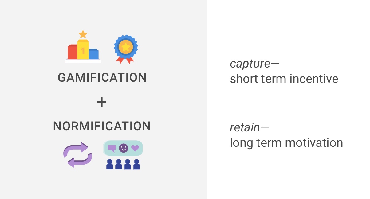
Voluntree attempts to enhance the experience of volunteering by introducing friendly competition amongst whole communities rather than just individuals. This way, the incentive to volunteer is not based on receiving material rewards, but rather the satisfaction of communal achievement. With the theme “social good” in mind, this mobile application aims to promote the idea of giving back to society through collective volunteerism and collaborative effort.
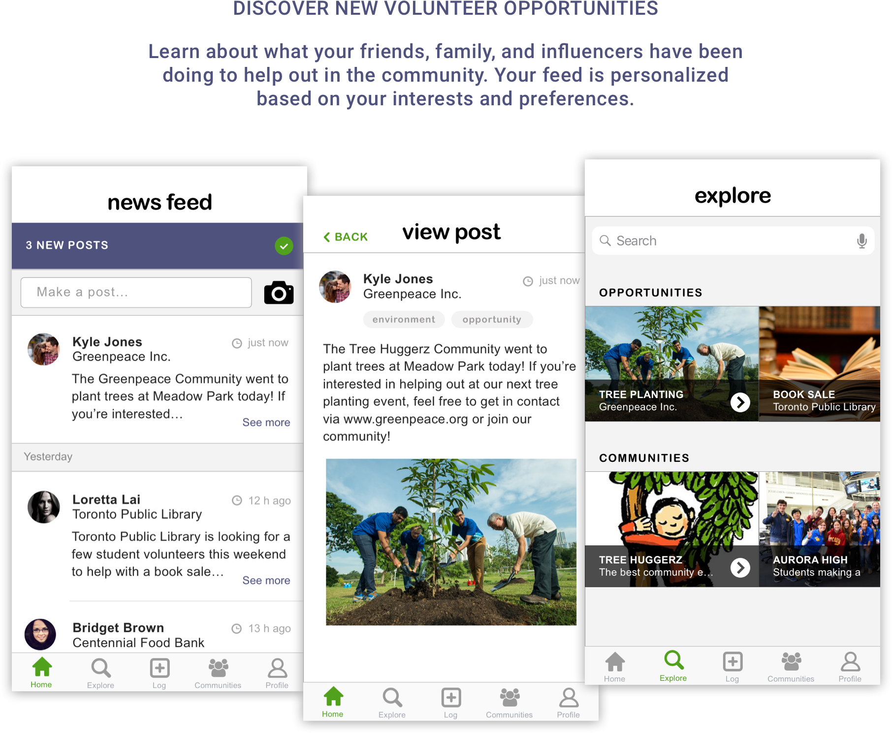
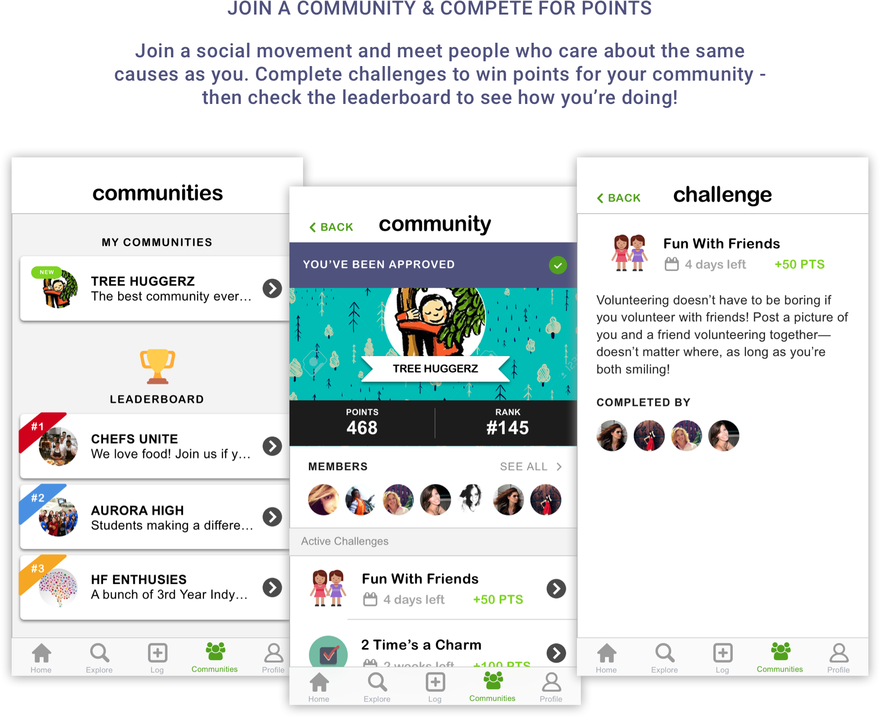
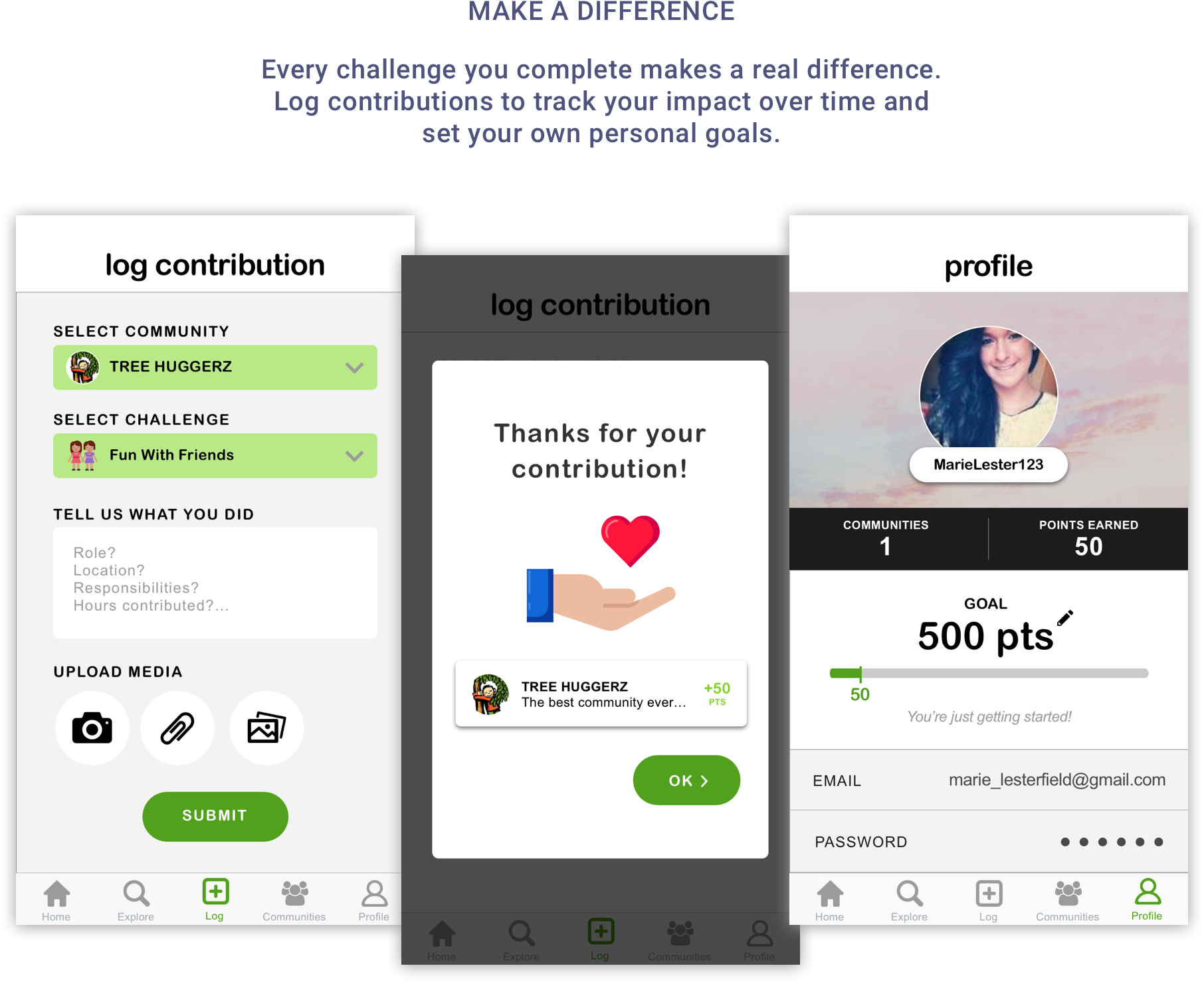
I was heavily involved in all stages of the project–from inception to finished product–but took the greatest lead in the design portion of the mobile app. I was responsible for translating our initial sketches into low-fidelity wireframes, developing the high-fidelity prototype, and implementing design changes post-usability test.
We first did a quick literature review to look into the problems that communities face with regards to volunteer participation. We also looked into the factors that motivate people to volunteer, including the science behind gamification and normification. We found that:
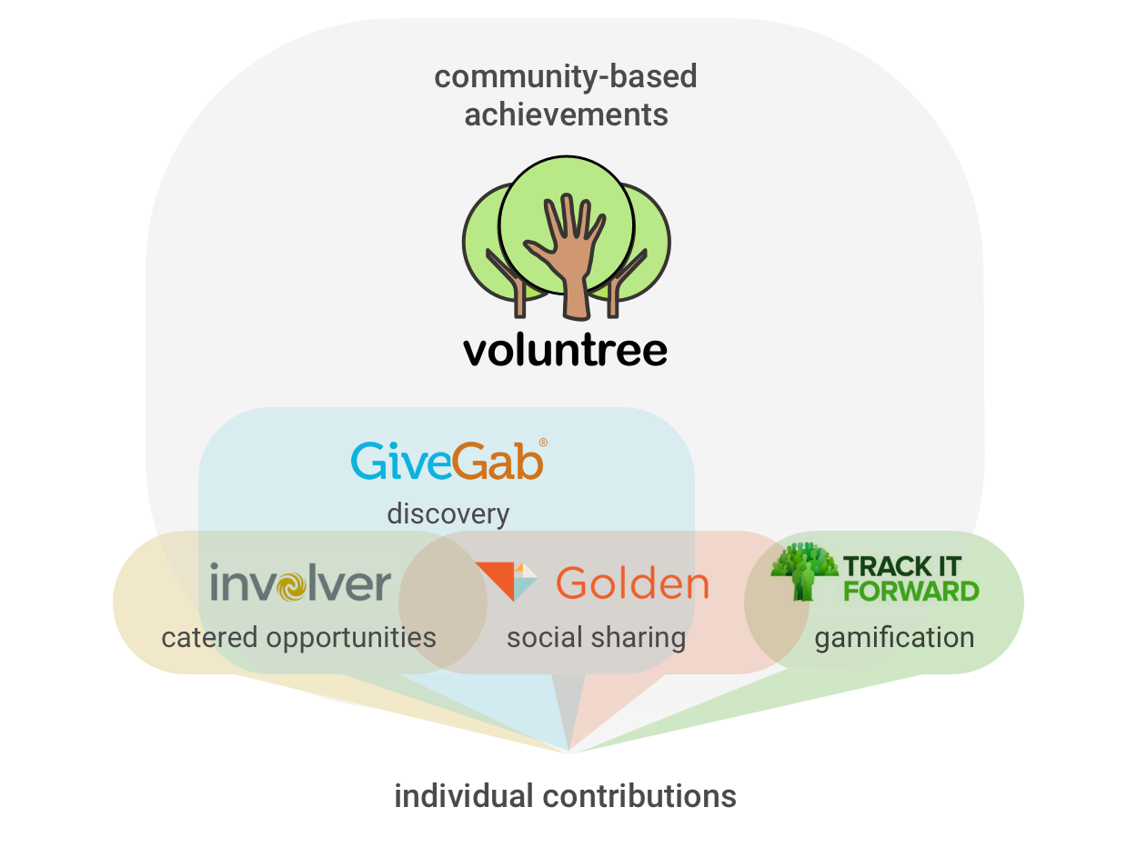
Through competitive benchmarking and market research, we were able to scope out what other similar volunteering platforms were offering. While most of those apps focused on eliminating barriers, Voluntree looked at what makes people want to volunteer in the first place. The idea was that Voluntree could work alongside these other matchmaking apps rather than compete directly against them.
We put out a questionnaire to gauge the types of users that would be potentially interested in using the app, as well as understand their interests, values and motivations behind volunteering. We received 120 responses with 70% of respondents being between 17-35 years old, and 60% of respondents being post-secondary students.

Some key insights include:
1
The most common sources of motivation for volunteering were 1) to give back to the community, and 2) personal obligation.
2
More people would volunteer if they 1) had more time, 2) they knew more about available opportunities, and 3) their friends who were also volunteering.
3
While 98% of participants said they enjoy volunteering, only 25% volunteer more than once a month.
4
Volunteering is seen as being more important to the community rather than the individual.
5
Users are generally more motivated to volunteer when part of a smaller, more intimate community.
6
More users would prefer to contribute to a community ranking rather than an individual ranking on a leaderboard.
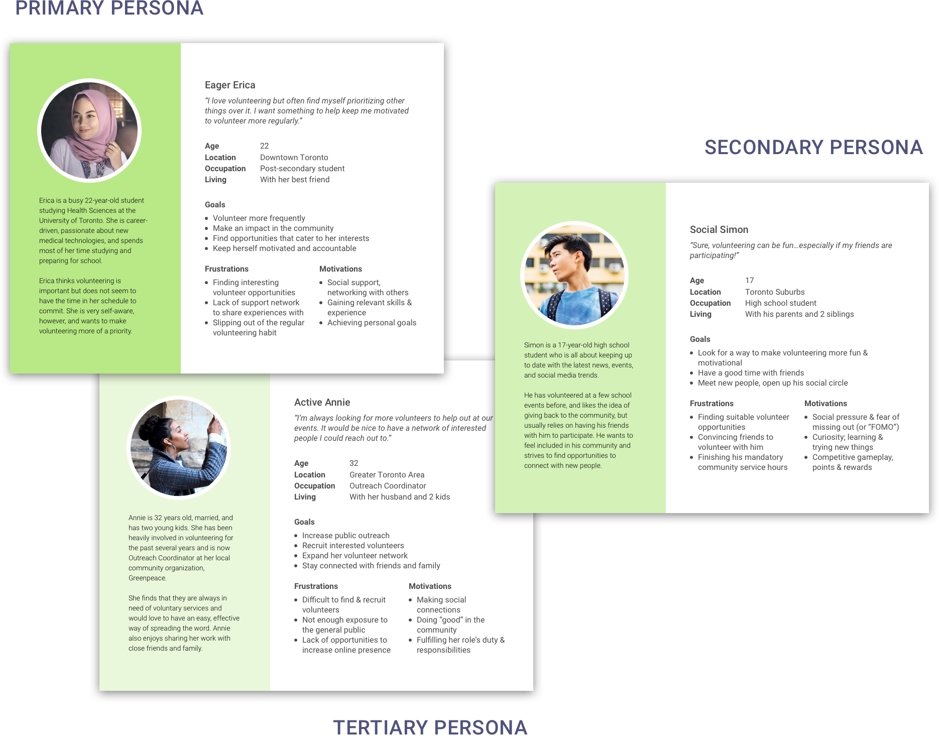
We identified our users to be mostly students and young working adults, generally between the ages of 15-35, who are technology equipped and interested in volunteering. I created a few personas to represent the different goals and motivations of each user group.
Based on the questionnaire we had sent out to users, we were able to do some initial feature scoping and prioritization. Some of the features that users found to be most valuable, in order of importance, included:
Using this data, as well as taking into consideration our findings from competitive benchmarking, we whittled down the main tasks that would be supported by our app:
For each main functionality within the application, I created a use case to show how users might interact with our system. Each use case was supported by a user scenario and requirements list. Below is an example of our two main use cases:
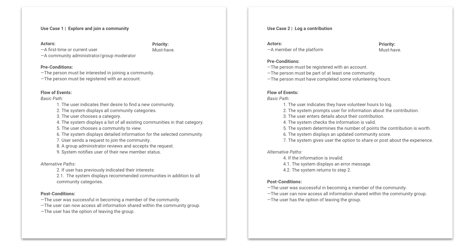
From these use cases, we then finalized a set of requirements that would guide us throughout the design phase.
Sketching, sketching...and more sketching! Many individual and group brainstorming sessions later, our team landed on two design alternatives, each of which had their own advantages and disadvantages. We decided to move forward with the first alternative design, which I turned into a set of low-fidelity wireframes in Axure RP.
Our high-fidelity mocks and prototype were created using Sketch + InVision. Check out the live prototype here.
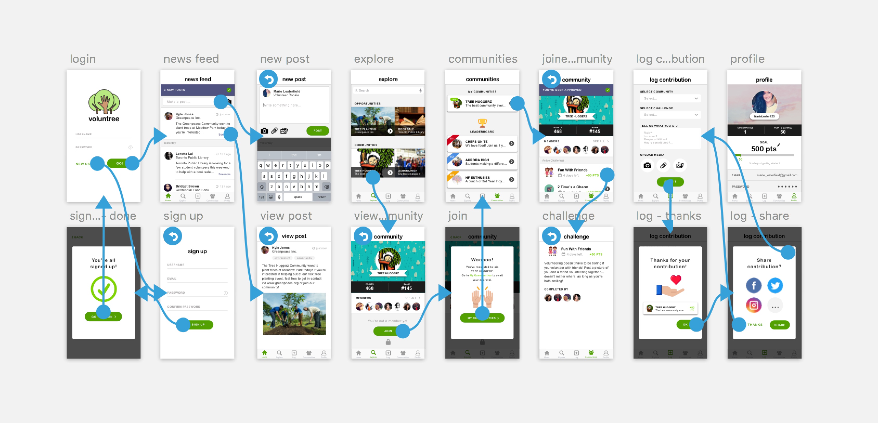
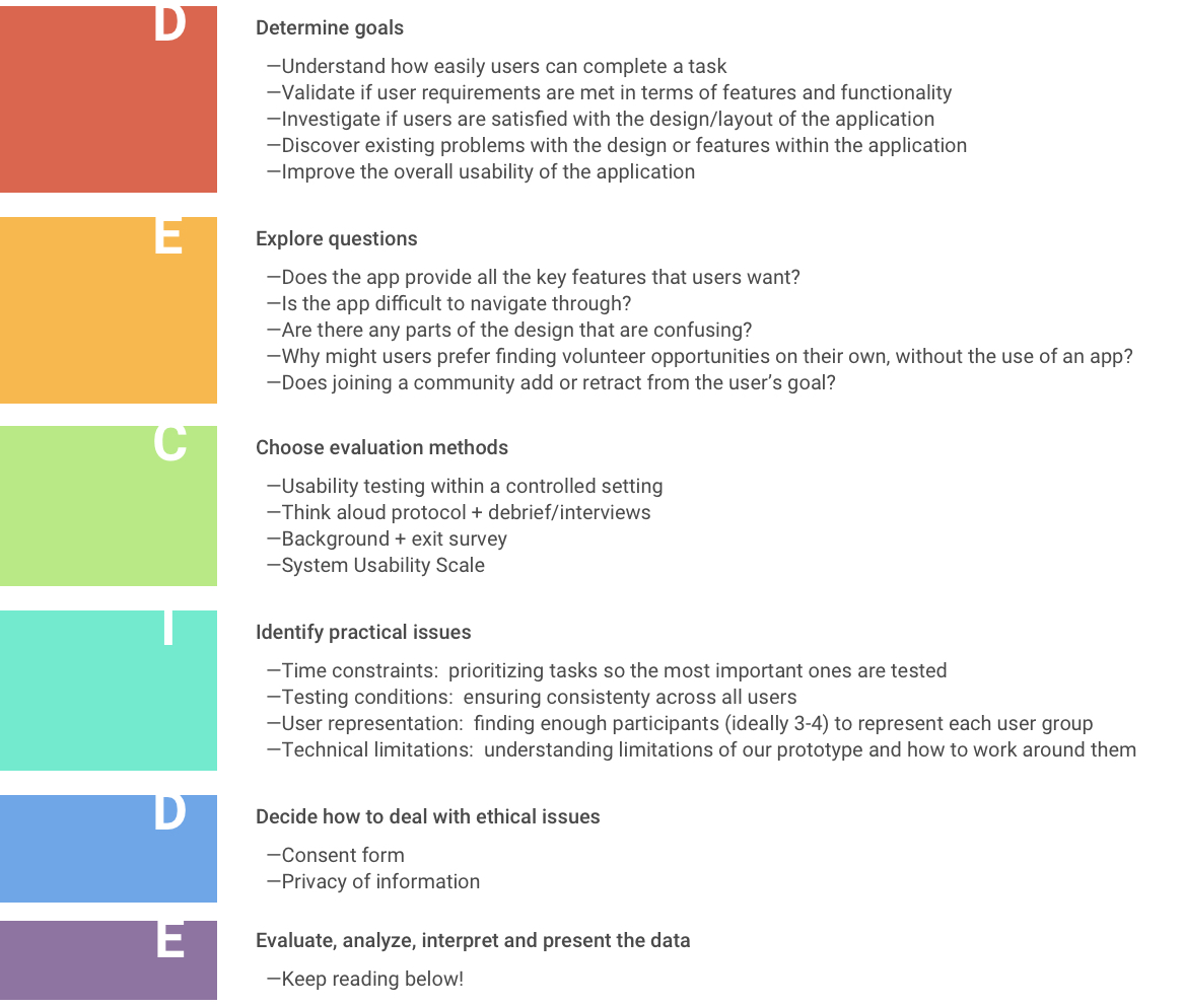
With the high-fidelity prototype complete, our next step was to do some usability testing. We tested 10 users between the ages of 15-30 from the Greater Toronto Area, all having a variety of volunteering experiences and interests. Using the DECIDE evaluation framework to prepare our usability protocol, we had participants perform 8 key tasks using our prototype.
Both quantitative and qualitative data were compiled and analyzed to pinpoint the strengths and the shortcomings of our mobile app. While there were a few task frustrations, most participants stated that they enjoyed the app, that it was aesthetically pleasing, and that they could see themselves using it in real life. Users especially enjoyed the social and gamification aspects of the platform, and thought the concept of communities was well integrated. Many appreciated how the app felt familiar and comfortable to use because of its similarities to other social media apps.
“The layout is quite nice. I like that the first thing I see is my news feed with opportunities. I also like how it integrates with my other social media accounts, like Facebook and Instagram.”
“Nice aesthetics. Clear and visible, not cluttered with functions. It’s very pretty and that makes me happy!”
Based on the number of errors made per task as well as the average time spent per task, it seemed that users had the most difficulty completing Task 4 (Joining the Tree Huggerz community), followed by Task 5 (Viewing a community challenge).
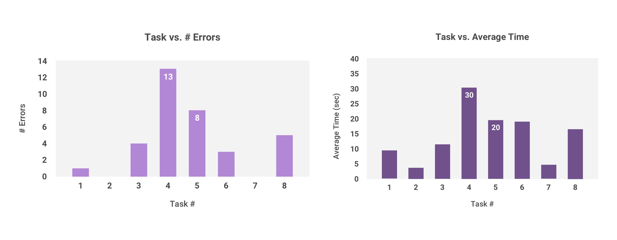
When asked about this during debrief, participants explained that it was because they couldn’t understand the difference between the “explore” and “communities” pages. It was unclear what content could be found under which tab. Users also found it difficult to find and access challenges within a community group, as they were located too deep within the navigational hierarchy.
“Having the bottom tab bar made it pretty easy to navigate, but sometimes the label [for a page or button] wasn’t obvious. For example, I expected to be able to search for communities in the communities tab rather than the explore tab. I also didn't realize challenges would be within a specific community–I thought it would be where the leaderboard was.”
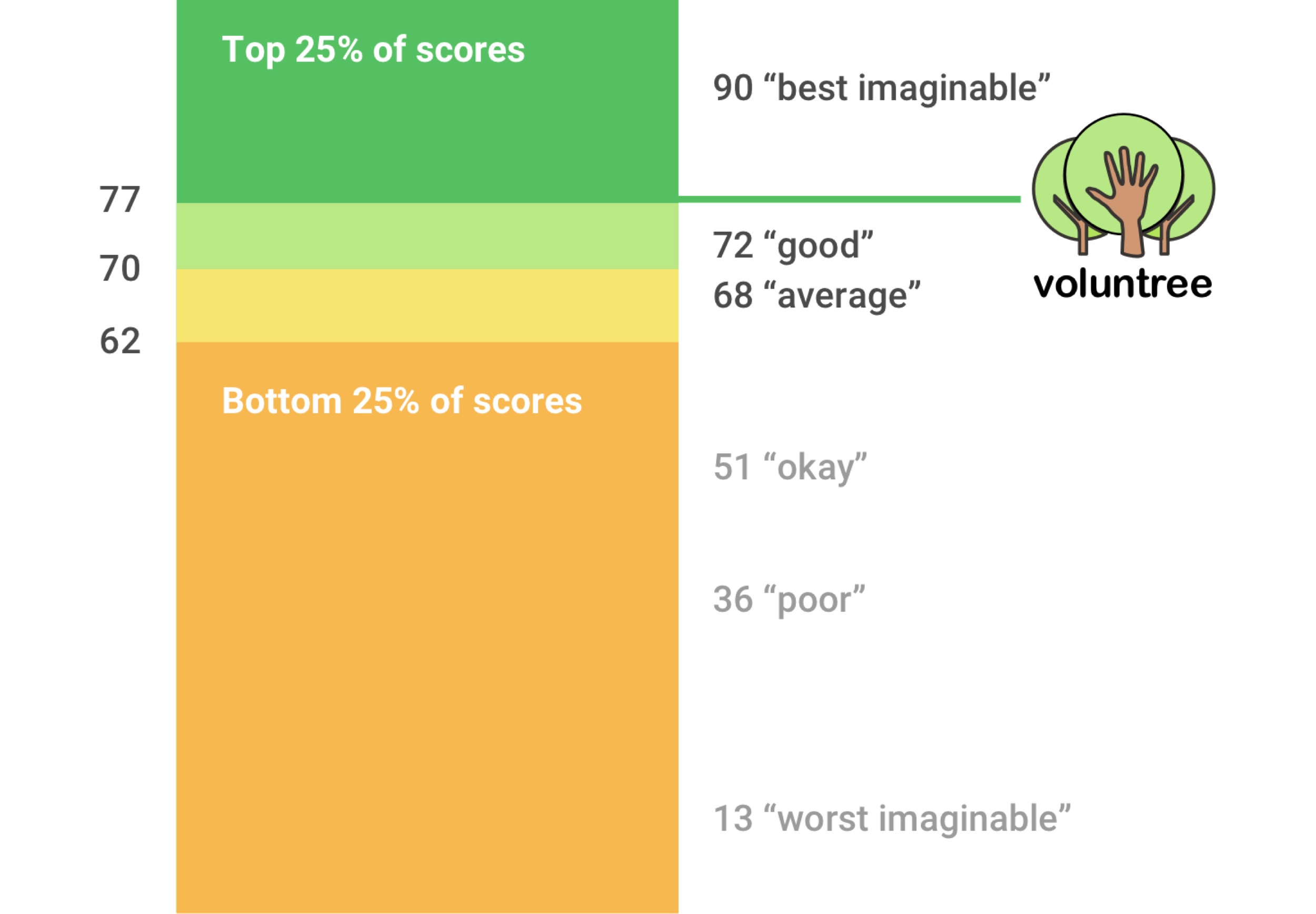
At the end of the usability test, participants were also given a system usability scale (SUS) to complete. The average system usability score across all ten participants was 77 out of 100–a number that puts Voluntree at an above-average SUS ranking. But while we were confident that users found Voluntree useful, usable and desirable, there was clearly still room for improvement.
After reviewing the results of our usability test, we were able to categorize the usability issues we came across into three levels of importance: critical, moderate, and minor. To address these issues, I mocked up several design recommendations that could be implemented in future iterations of the product.
On behalf of my team, I presented Voluntree at a Human Computer Interaction showcase hosted by the University of Toronto's Faculty of Information (iSchool). The event featured design work from a variety of students, and was attended by a mix of students, university professors, and industry professionals. Voluntree was one of only 2 undergraduate projects chosen to be presented amongst other graduate level projects. Our project garnered much interest as something that was unique, fun, and socially responsible, and was overall well-received by our audience.