JourneyOn
Empowering people with type 1 diabetes to travel with confidence
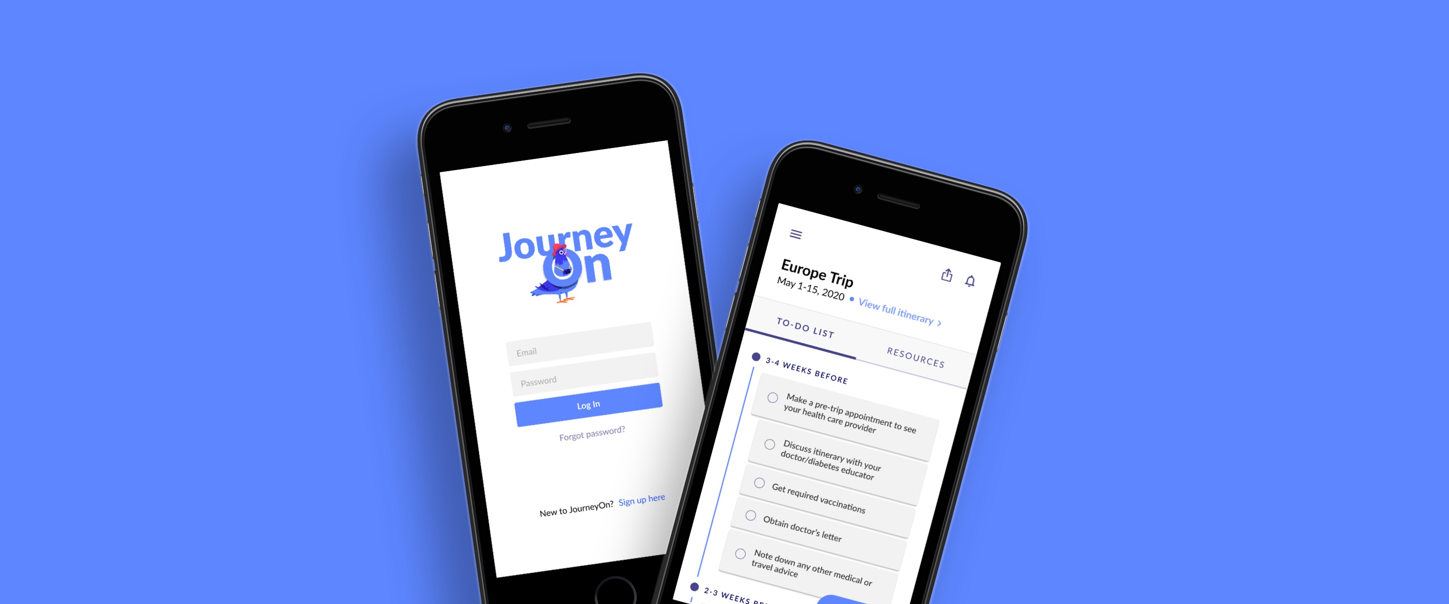

During my final year in the undergraduate Industrial Engineering program at the University of Toronto, I had the pleasure of working on a capstone design project with Healthcare Human Factors (HHF) to design a solution that would tackle the challenges that people living with type 1 diabetes face while travelling.
You can read the shortened version of this case study on Medium here.
Designer
Sep 2019 - Apr 2020
Figma
Ryan Cheng, Meggie Debnath, Lauren Ip (me!)
Type 1 diabetes is a chronic disease that affects the way your body regulates blood sugar, or glucose. While glucose is used to fuel your body’s cells, it requires the help of a key hormone called insulin—which people with type 1 diabetes (T1Ds) are unable to produce. Without insulin, blood sugar levels can spike up and down to extreme levels very quickly.
Most people are familiar with type 2 diabetes, as it is much more common than type 1. However, they are different diseases with unique causes and challenges. People with type 2 diabetes have insulin resistance, meaning the body can still produce insulin, but is unable to use it effectively. T1Ds are unable to produce insulin at all, which makes basic nutritional management much more complex. We decided to focus on type 1 because of the greater risks associated with travel.
While a vacation trip to Mexico might mean relaxation and enjoyment for most people, it can mean stress and anxiety for T1Ds. There is a huge amount of planning and uncertainty associated with travelling with T1D that often detracts from an ideal experience—for example, keeping track of supplies/medications, constantly monitoring blood sugar levels, and preparing for life-or-death emergency situations.
These travel-related factors can cause certain stressors and trigger emotional responses, often classified as diabetes distress. Our goal was to decrease this distress among T1Ds and instead increase their overall confidence in travelling.
Although there are existing resources that provide T1Ds with general tips and advice, many of them only address certain aspects of the travel journey, and are impersonal to their itinerary, treatment plan, and preferences. Users must actively seek out information that is relevant to their own situation, adding unnecessary burden to an already stressful process.
So, we developed a digital travel companion called JourneyOn, a mobile application that guides T1Ds through the entire traveling process, from planning and preparation to getting around their destinations. JourneyOn helps alleviate the burden of gathering and packing supplies, improves interactions with security authorities, and provides resources to navigate a variety of different travel situations, all in a smart and personalized way.
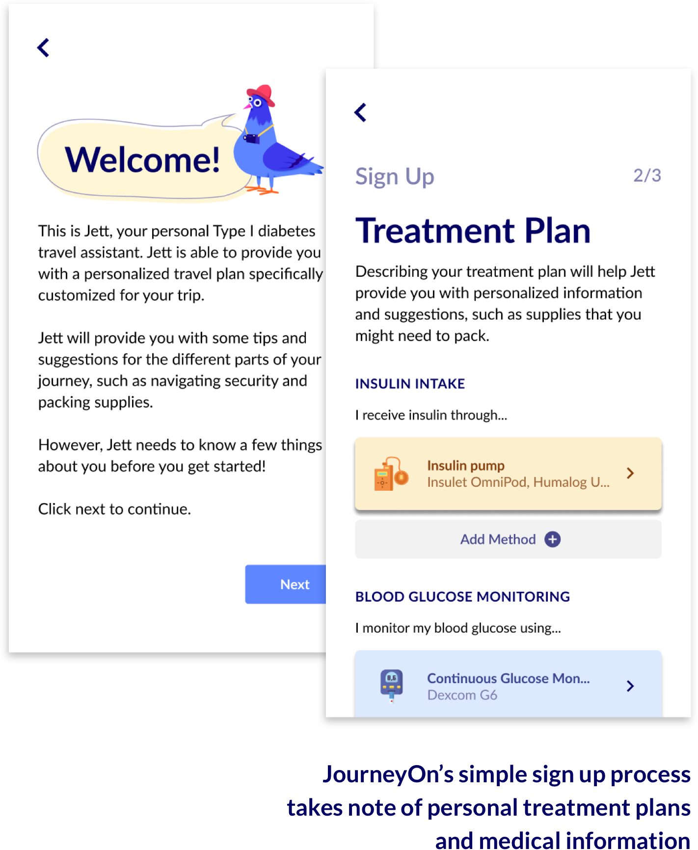
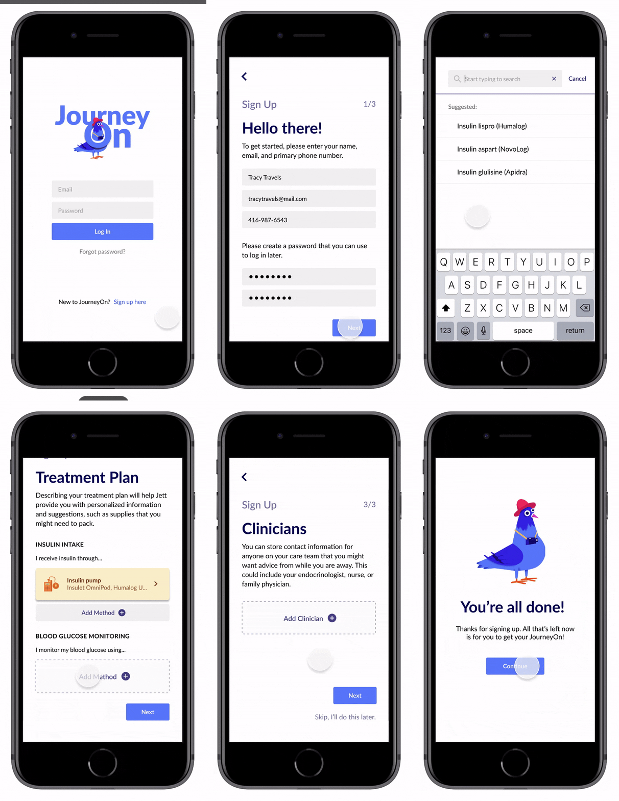
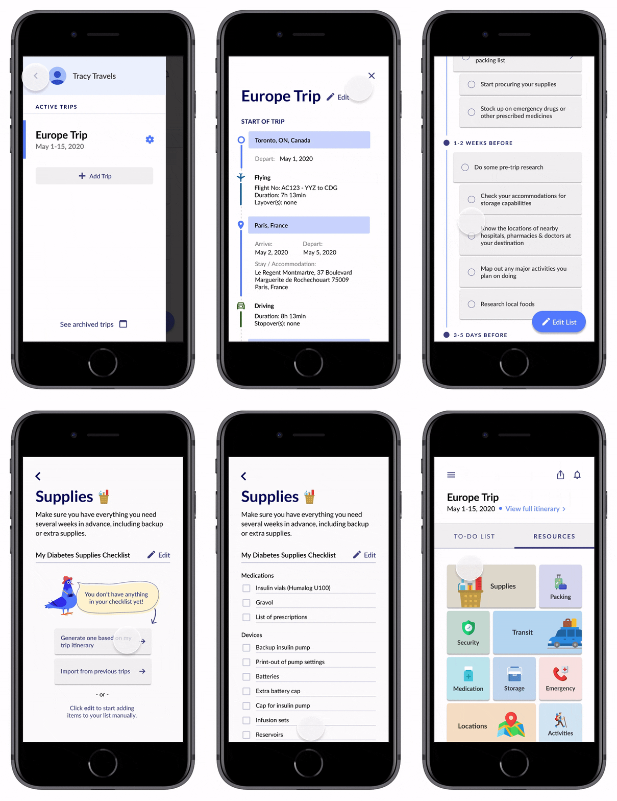
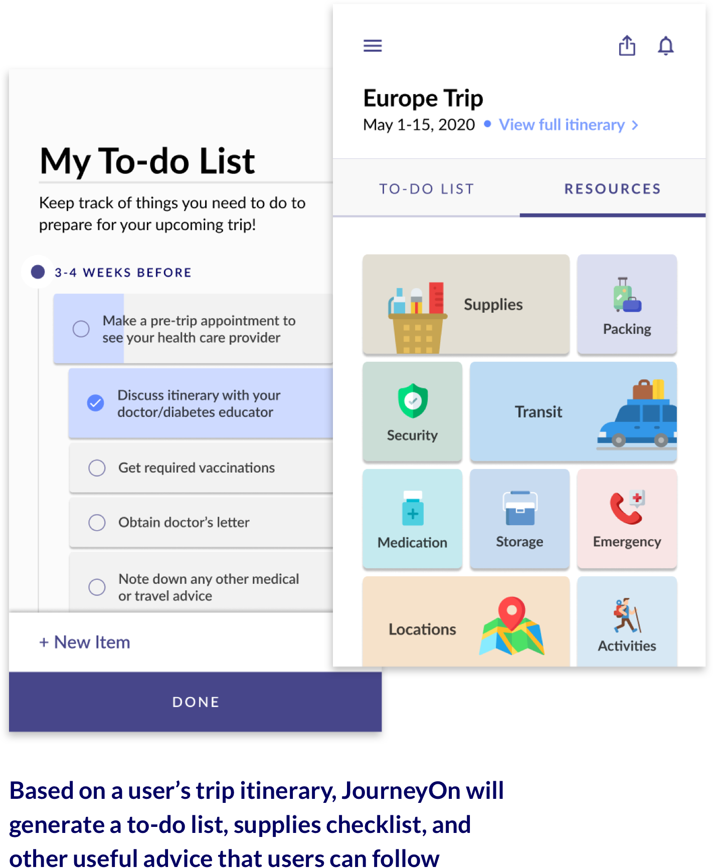
My team and I carried out research activities such as stakeholder interviews, user interviews, research synthesis and usability testing. During the design phase I led the prototyping and visual design portion of the process, turning our low-fidelity wireframe sketches into a testable prototype using Figma.
My team reviewed a variety of literature and online publications in order to better understand the problem space and identify current gaps in technology. We scoured online communities, forums, and social media to collect some initial data (in the form of comments, discussions, etc.) from representative users.
In order to dig deeper into the underlying factors that influence their travel experiences, it was incredibly important for us to conduct 1-on-1 interviews with T1Ds. We created a safe and open environment where T1Ds were comfortable sharing their lived experiences and were able to express how these challenges affected them on an emotional level. At the end, we left with five key takeaways:
1
Inherent fear and anxiety are associated with a T1D’s first few trips.
2
Feelings of fear and anxiety intensify when travelling to an unfamiliar destination or a remote location.
3
Most stress is generated during the planning phase, since it involves thinking about worst-case scenarios.
4
T1Ds rely heavily on supports and resources to help them prepare for their first few trips.
5
Travel companions ease the travelling process by providing support throughout.
The interviews also provided insight into the main challenge areas that T1Ds encounter while travelling:
Awareness and control of blood glucose levels
Determining how unfamiliar foods, activities, or time zone changes affect blood glucose levels can put T1Ds in a stressful and precarious situation.

Getting help in an emergency situation
Determining how unfamiliar foods, activities, or time zone changes affect blood glucose levels can put T1Ds in a stressful and precarious situation.
Making a detailed medication list
Not only do T1Ds keep a record of their medication and insulin pump settings, they may also have to anticipate that certain countries have different names for the insulin they use.

Navigating airport/border security
If security personnel are unfamiliar with type 1 diabetes, T1Ds may receive questions about their insulin pump or snacks that they are bringing, which can be a frustrating and uncomfortable interaction.

Gathering of supplies
Figuring out what insulin pump and glucose monitoring supplies are needed and determining how much they should bring as a backup can be a daunting task.

Storage of supplies
Ensuring that their supplies, especially insulin, are kept at the right temperature and remain intact can be challenging, especially if encountering varying environmental conditions.
Icons made by Smashicons, photo3idea_studio, Freepik & Pixelmeetup from flaticon.com.
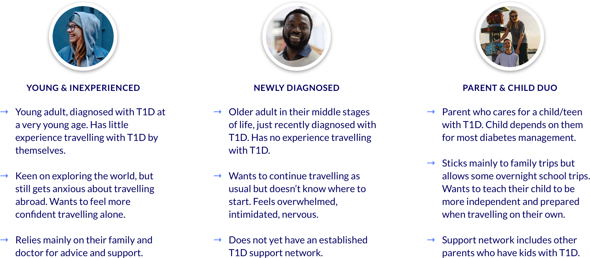
We realized that the emotional stress surrounding travel for T1Ds stemmed from a general lack of knowledge/experience. Those who had lived with T1D for much longer had already figured out their own methods and processes for travel, simply based on lived experience. Where there was a greater gap in knowledge was for those who were less experienced with T1D travel, such as youth/young adults with T1D, or someone who was recently diagnosed with T1D in a later stage in life.
We decided to focus on the following 3 user types, all with limited experience travelling with T1D by themselves: 1) Young & Inexperienced, 2) Recently Diagnosed, and 3) Parent & Child Duo.
During our brainstorm we sketched out a light journey map to capture the pain points and emotional experiences felt by T1Ds throughout a typical travel journey. We outlined opportunity areas at each stage of the journey, which helped us come up with a set of solutions/features that addressed the specific challenges that T1Ds face.
A mobile application was selected as the primary solution due to its capacity to provide personalized information to the user, on top of the convenient, accessible, and portable nature of the digital platform itself. After narrowing down an MVP set of features based on importance and feasibility, we started to whiteboard a rough outline of what the mobile app would look like.
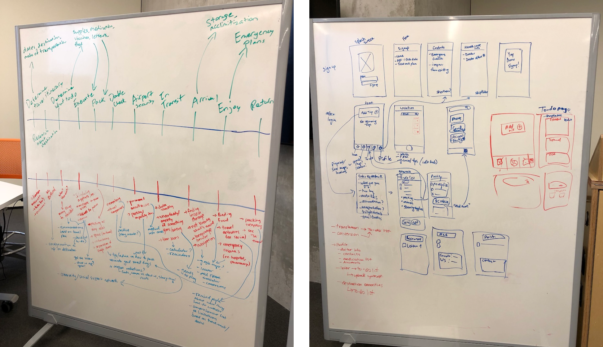
I then took our sketches and turned them into a more detailed low-fidelity prototype in Figma.
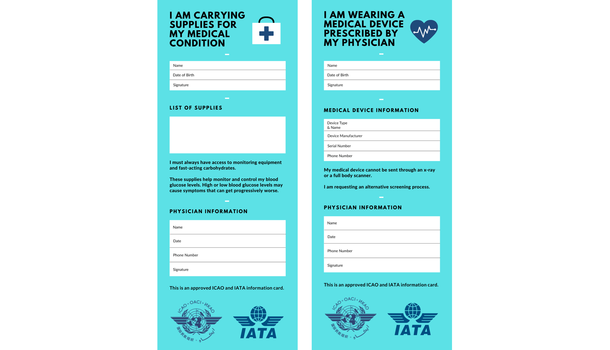
We also mocked up a complementary part of our solution, an improved medical information card for T1Ds to show airport security personnel when checking in carry-on baggage (allowing them to bring in certain medical supplies and wear their insulin pump).
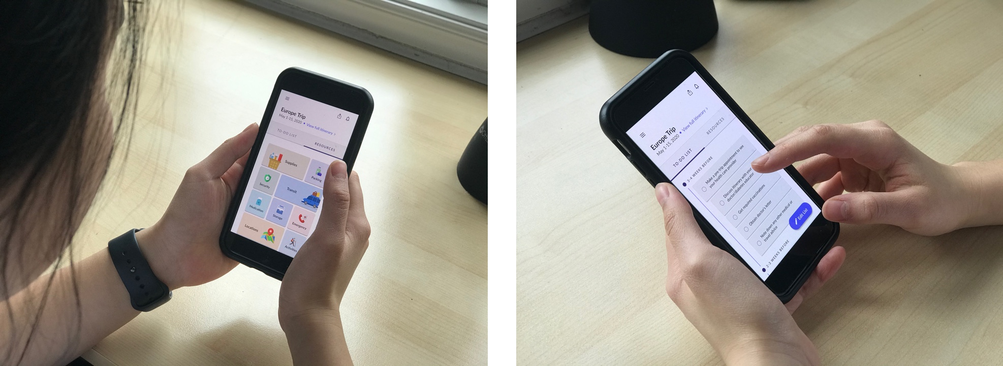
We tested the first iteration of our prototype with real users to get feedback on the overall design concept and product features. We had a total of five participants, ranging from ages 15 to 58 and including both T1Ds and their caregivers. An effort was made to recruit T1Ds who were more recently diagnosed, therefore having less experience travelling with T1D.
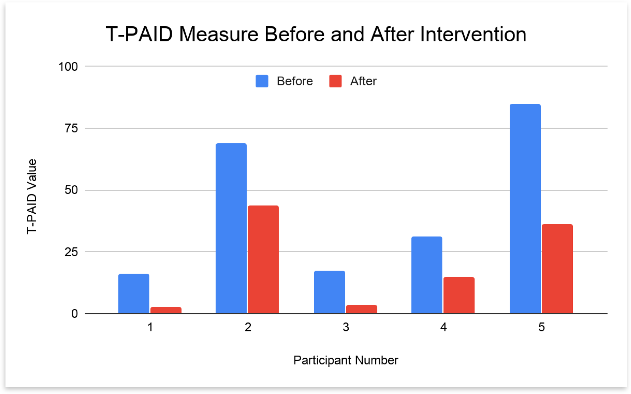
We used the T-PAID scale, a travel-related version of the Problem Areas in Diabetes (PAID) scale, to measure diabetes distress in users before and after using JourneyOn. The results showed a mean reduction of 23.5 points (SD = 14.9) in diabetes distress, which indicates a very effective intervention. A system usability score (SUS) questionnaire was also given to participants to assess the overall usability of the prototype, with a resulting mean SUS score of 88.0 (SD = 10.8) on a scale of 100.
23.5 points
mean reduction in diabetes distress. A 10-15 point reduction is an indication of an effective intervention.
88.0
mean SUS score. A score of 68 is considered "average", and above 85 is "excellent".
Overall the design received very positive feedback from users. Most features were generally seen as useful, though we received many suggestions for ways to make our feature set more robust.
5 out of 5
participants found the app intuitive and easy to use overall
5 out of 5
participants would use the app for their actual travels
4 out of 5
participants felt the app would help them travel with more confidence
“This all-in-one-place capability of the app alleviates the burden of self-searching. It’s like I can get reassurance from the app rather than other people.”
Participants thought the to-do list and supplies checklist were the most useful features. They liked that it was tailored to their personal itinerary and treatment plan, but also emphasized the value of being able to customize or edit any auto-generated content from the app.
“I don’t usually use diabetes apps, but this to-do list with the timeline is useful for keeping track of things.”
Some key areas of interest that came up often across participants included:
We also got feedback on features that were less useful, or required further consideration due to concerns over privacy or feasbility.
“Meal management doesn't feel like an appropriate area to receive advice here. It’s difficult to get accurate nutritional info such as carb counts, so I wouldn’t trust this anyway.”
“If the airport was aware of the medical information card, it would be useful. But I’m wondering if the card would be trusted by security. How would they validate its authenticity?”
Using the feedback we got from users, we made some important design changes to the initial prototype and made it higher-fidelity.
The goal of JourneyOn was to reduce overall TDD levels throughout one’s travel journey. Our hope was for the application to allow users to feel less burdened by the amount of information they would normally have to search for or remember themselves, and ultimately inspire greater confidence in travelling. The “final” design places emphasis on:
Check out the full JourneyOn prototype below.
Initially we had planned to do one more round of testing, to see what users thought after we made improvements to our first design. However, due to COVID-19 circumstances, we were only able to show our high-fidelity prototype to 2 users. (Can’t really say much about the results of two participants, but both had an overall positive reaction to the design, if you were curious).
Through our work with Healthcare Human Factors on JourneyOn, we were able to help them further their research and thinking around designing for the diabetes community. We hoped that our research would not only empower the greater diabetes community, but also inspire others to address these kinds of unique needs and experiences using a user-centered design approach.
As part of our efforts to disseminate this research to the broader public, we published a medium article about our project and design process. You can check it out here.
One of the biggest challenges in this process was finding representative users who were willing and able to participate in our studies. While we still gained valuable insights from the small group of T1Ds/caregivers who did participate, a larger variety of participants might have given a more in-depth representation of specific needs across the T1D/caregiver population.
Another challenge was the huge learning curve. I went from having little to no understanding of type 1 diabetes, to learning all about how insulin pumps work; the difference between a Continuous Glucose Monitor and a Flash Glucose Monitor; what a basal/bolus ratio is; how important it is for insulin to be kept at cool temperatures...and the list goes on! But this all goes without saying that what made our app stand out to users was the attention we paid to those finer, nuanced details.
Given more time and resources, there were several areas of consideration we would’ve liked to explore in the future:
I found it to be such an eye-opening experience to be able to talk to real people living with Type 1 diabetes, and try to understand what they go through day-to-day. Learning about T1D through literature simply does not compare to learning from very human stories—something that should be considered in ALL design processes.