GameStop
Improving customer engagement & user experience of an online loyalty program
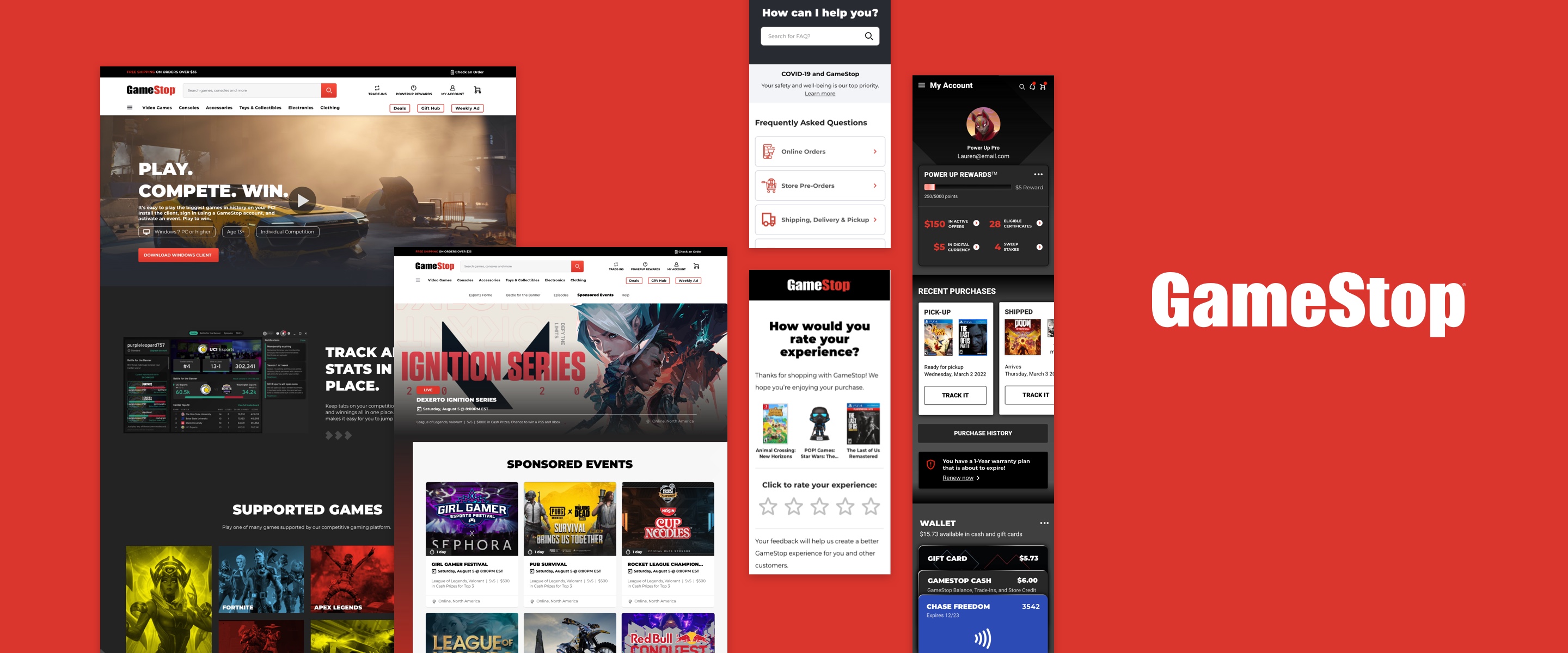

As a part of the GameStop account at Publicis Sapient, I worked with GameStop’s Customer Engagement Team to improve the user experience of their online loyalty program & user account flows within their consumer-facing website.
My team was asked to surface UX issues, highlight high-impact areas for improvement and provide design recommendations to address painpoints throughout the end-to-end experience.
Experience Designer @ Publicis Sapient
Feb 2021 - June 2021
Adobe XD, MURAL
Lauren Ip (me!), Tucker Williams, Suresh Babu Sri Ram
But as the world has gone more and more digital, accelerated by the pandemic, GameStop has struggled to keep up with its competitors in meeting the changing demands of a tech-savvy, digital-first consumer base.
As part of GameStop’s digital transformation effort, my team was asked to help their Customer Engagement Team redesign their currently outdated website, conceptualize designs for new areas of business, and consult on ways to improve overall customer experience.
I collaborated with the Customer Engagement team on three main areas of work:
I was the primary UX designer for the survey design, and most of the website redesign pages (customer service & account, with secondary contribution to the loyalty pages). I worked closely with a UX Lead and visual designer to put these page redesigns together, and communicated frequently with our PM’s and developers regarding requirements and feedback. I also contributed high-fidelity concept work for the e-sports and mobile app.
Throughout the project, we worked with our stakeholders and a research team to better understand GameStop’s consumer base. They presented us with findings from user interviews conducted online and in-store, through which we were able to understand overall customer sentiment towards certain website features and the GameStop brand as a whole.
We also used quantitative data garnered from market research surveys to understand general market trends and consumer behaviour patterns.
With limited time and resources to spare, our stakeholders were initially focused on banging out features that were considered low-effort, but relatively high return.
One of the first designs I worked on was a customer satisfaction survey flow, an important part of the marketing communication journey that would allow Gamestop to receive valuable feedback from customers about their purchase and shopping experience.
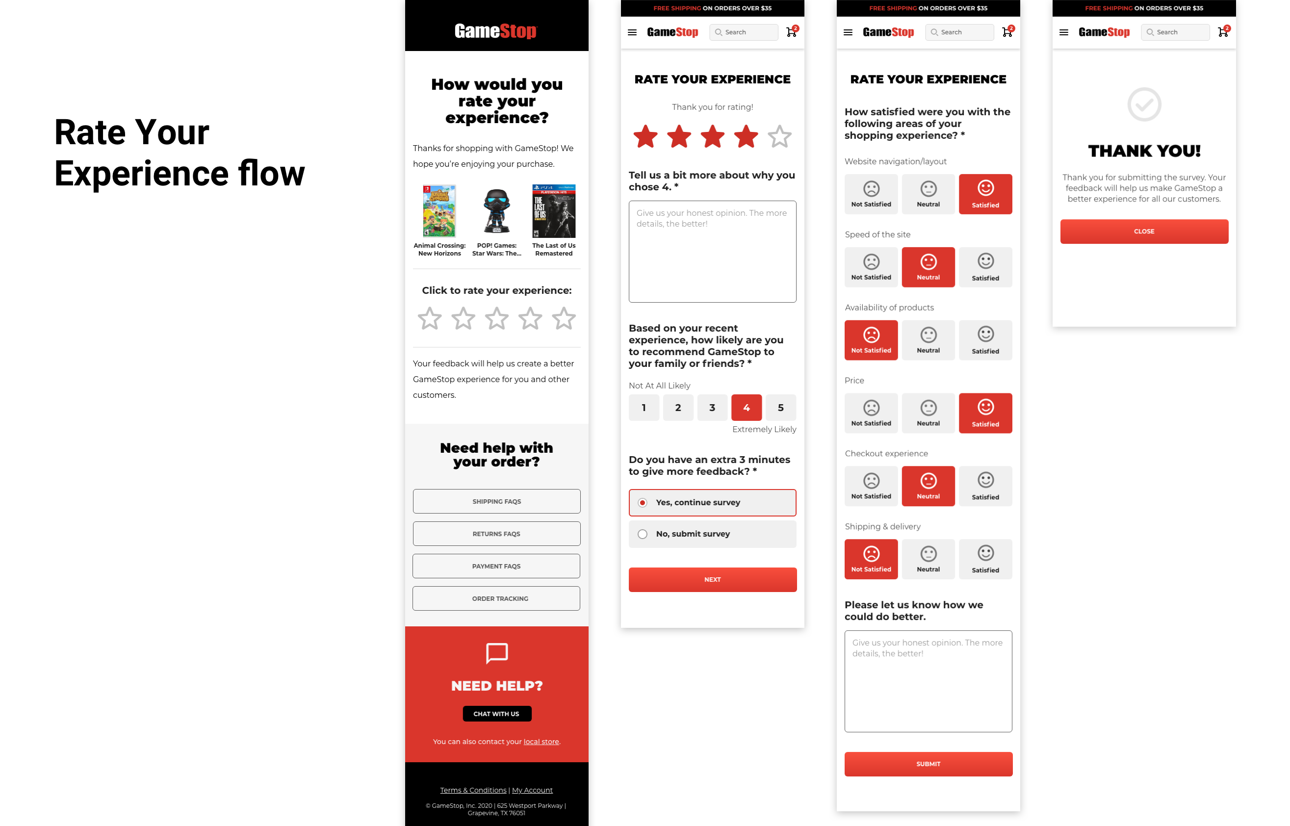
Balancing ease of completion with generating enough quality information was an important consideration. I designed the initial email to be short and sweet, yet honest about why we were collecting feedback. I suggested we display the customer’s most recent purchase to help jog their memory but also also personalize the experience, making it easier and more meaningful for customers to give a rating.
We then gave GameStop’s account, loyalty, and customer service pages a UI refresh to make them feel lighter, cleaner, and more modern-looking. This included updating colours, font styles, buttons, form field interactions, error states and other components in correspondence with GameStop's constantly evolving design system.
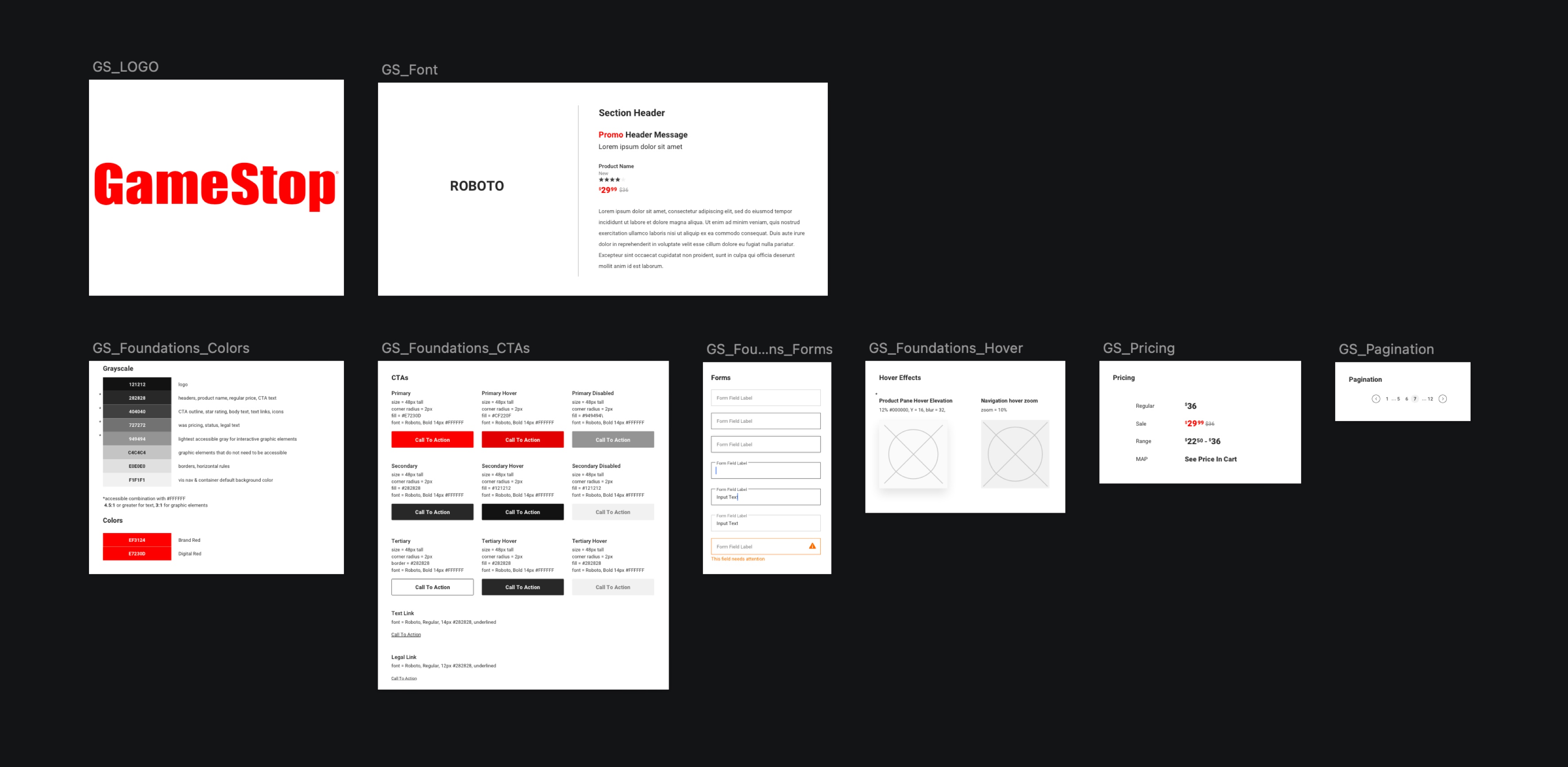
With each page we pushed to make quick but powerful UX improvements where we could, making the website more usable, useful and desirable. We aimed to simplify the experience yet bring focus to the actions that we wanted users to take. And we wanted to make the experience more intelligent by using data in a meaningful way.
Improving online customer service resources was a priority for the GameStop team. One of our business goals was to improve the self-serve experience for customers while making it easy to reach a GameStop customer service rep when assistance was needed.
The current FAQ page required a huge overhaul as it felt clunky and disorganized with an overwhelming amount of information. I drew up a couple of low-fidelity options and then worked with a visual designer to produce higher-fidelity screens. We decided to use an accordion format to display the most relevant Q&As for each topic, which would be curated by the content team based on FAQ data from current customers.
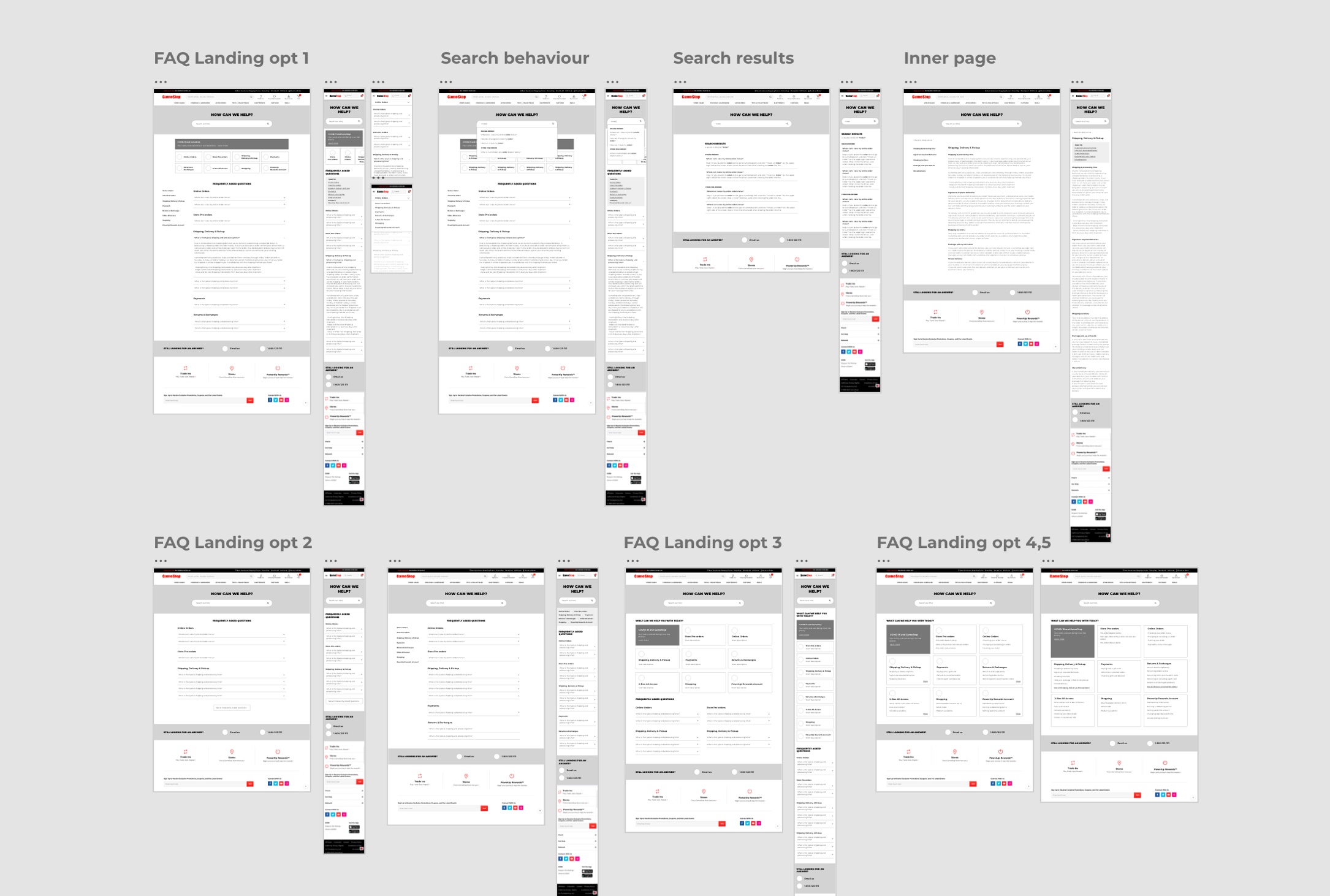
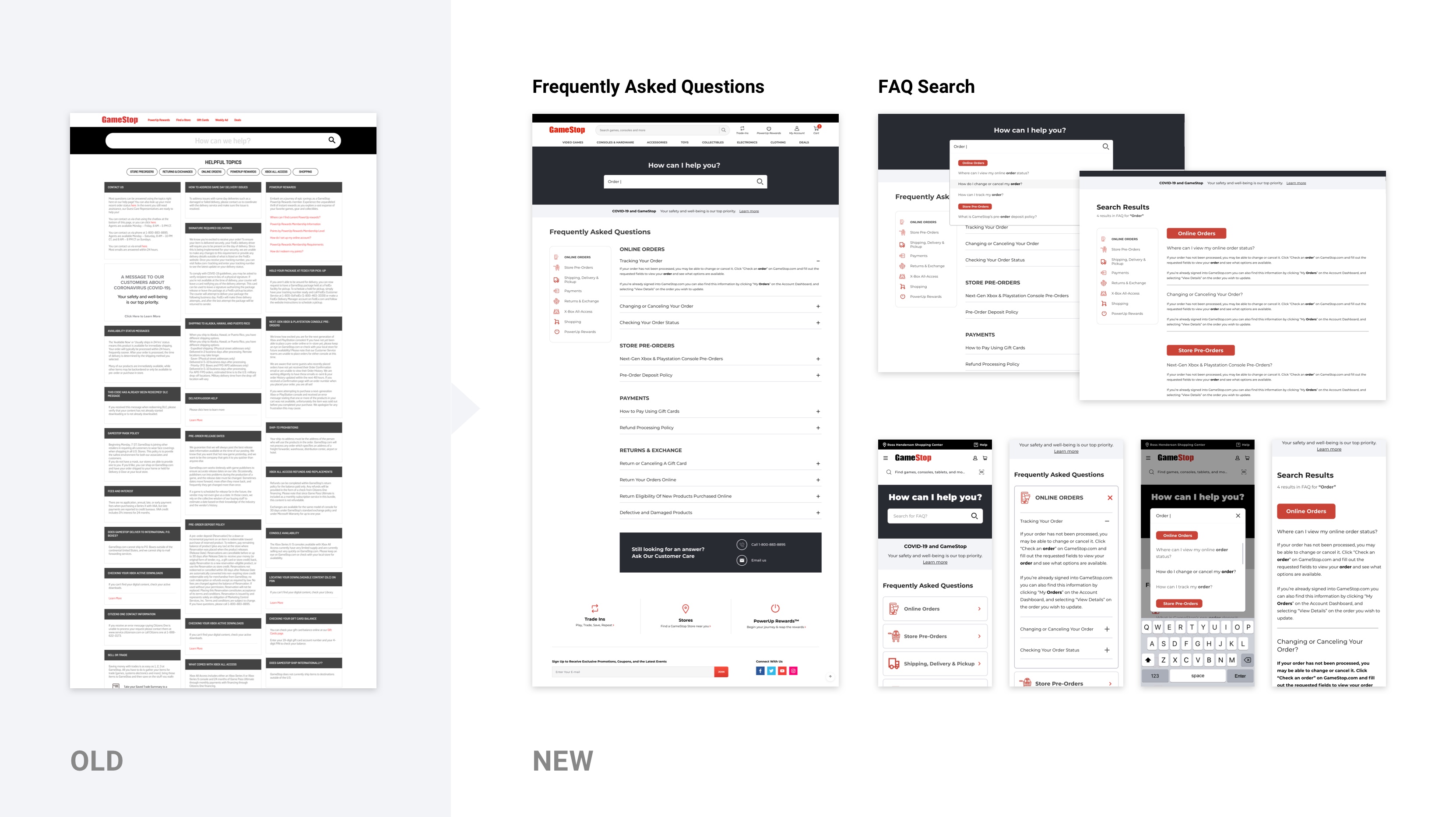
We called for emphasis on predictive search functionality, and showed how the results might be displayed. Finally, we added a bold section at the bottom to call attention to Customer Care in case customers needed further assistance.
For Contact Us, we simplified the submission form and provided more context around response time and available methods of contact.
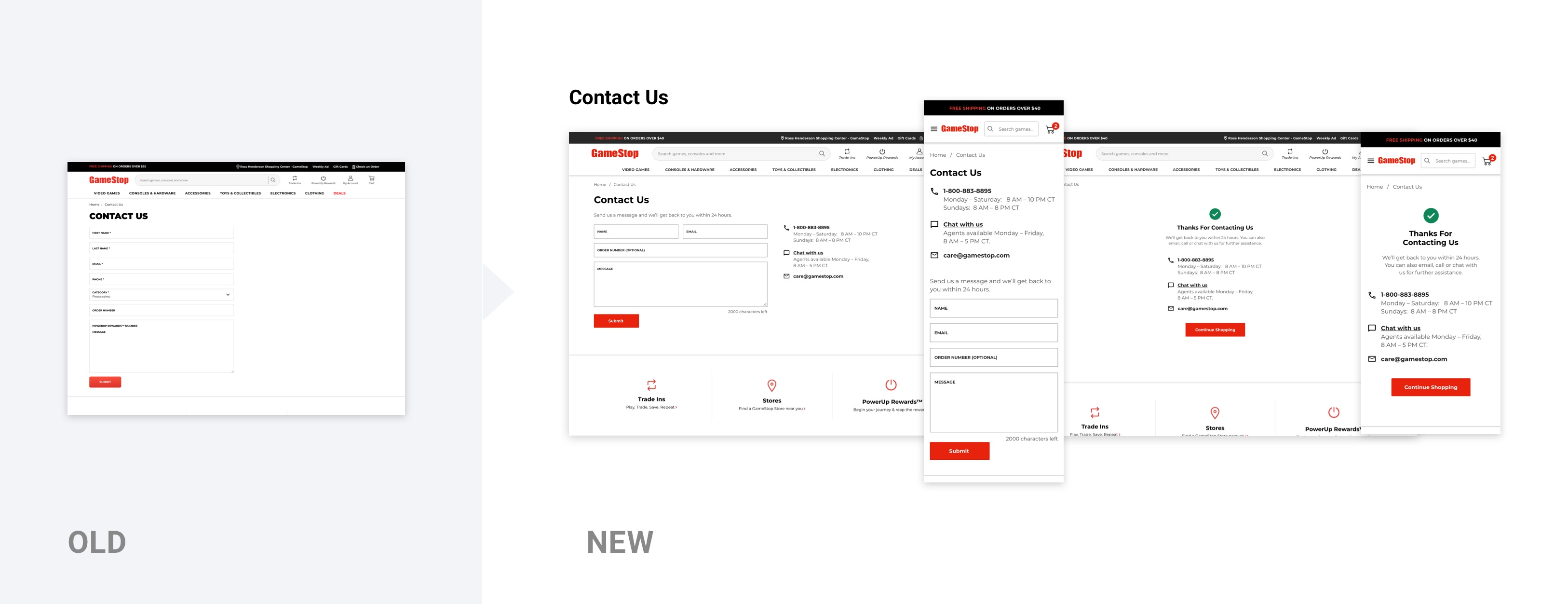
We followed a similar design process as the FAQ and Contact Us screens. First, we worked with our product team to define business goals, user goals, and uncover any constraints. I’d conduct light competitive analysis where applicable, then dive into design exploration. After a few rounds of feedback I turned them into high-fidelity designs for developer handoff.
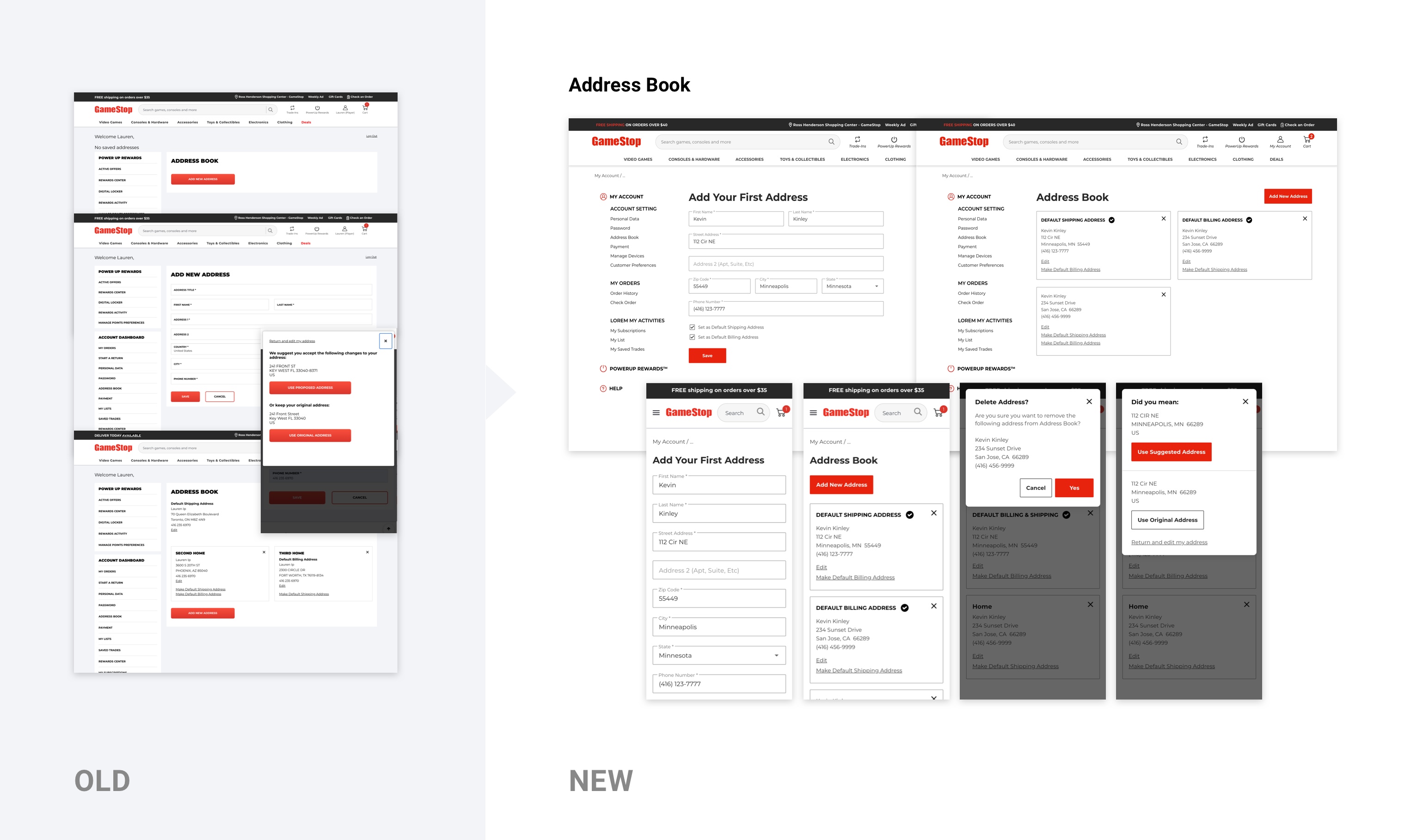
Address Book (above)
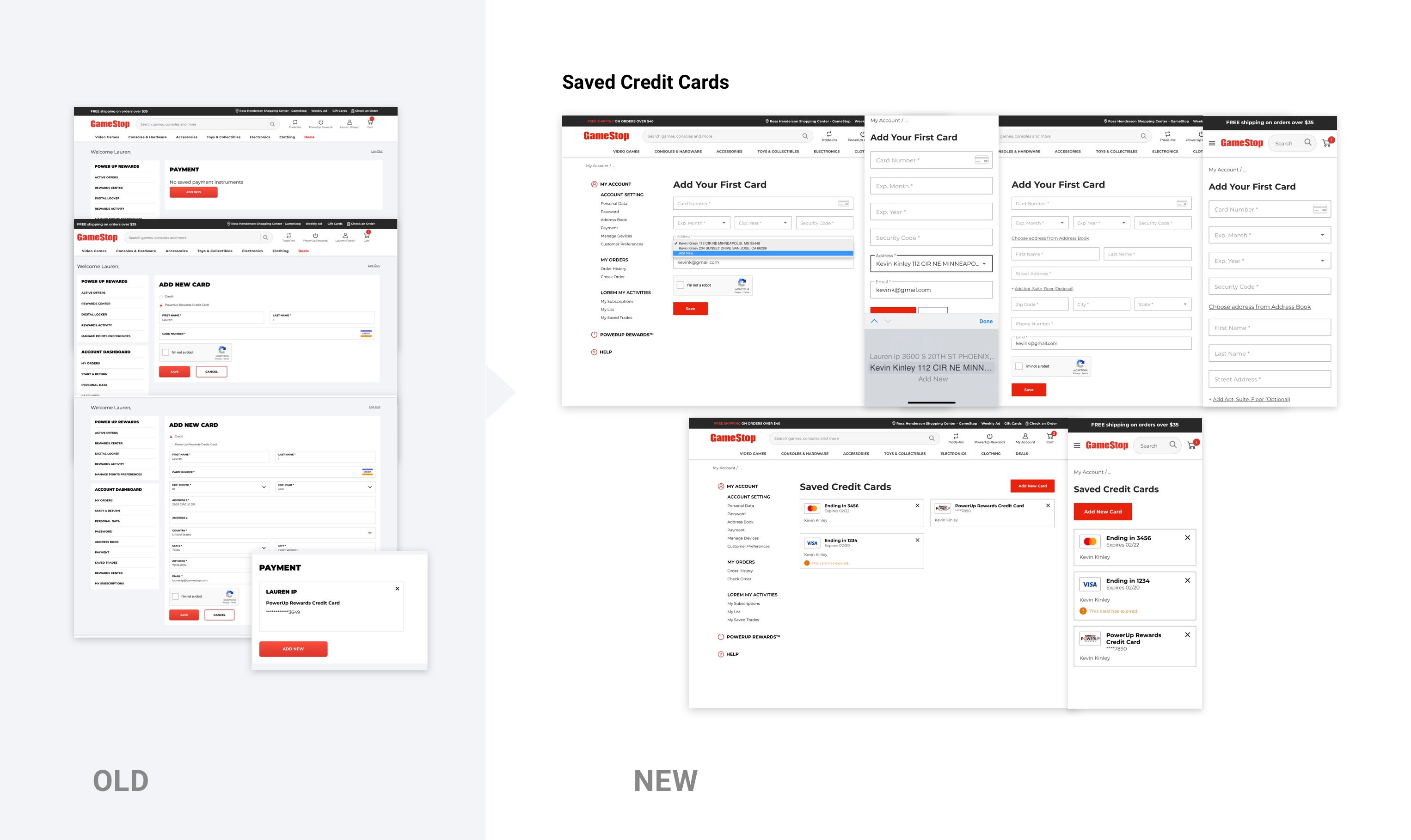
Saved Credit Cards (above)
Personal Data (above, 1): Displayed information as individual editable fields (rather than a persistent form), under the assumption that personal information shouldn’t change very often.
Change Password (above, 2): Displayed password requirements upfront so users know what they are beforehand. Also proposed showing conditional feedback while users type.
Order History (above, 3): Improved the visual styling and layout to produce a cleaner, more cohesive look and enhance readability.
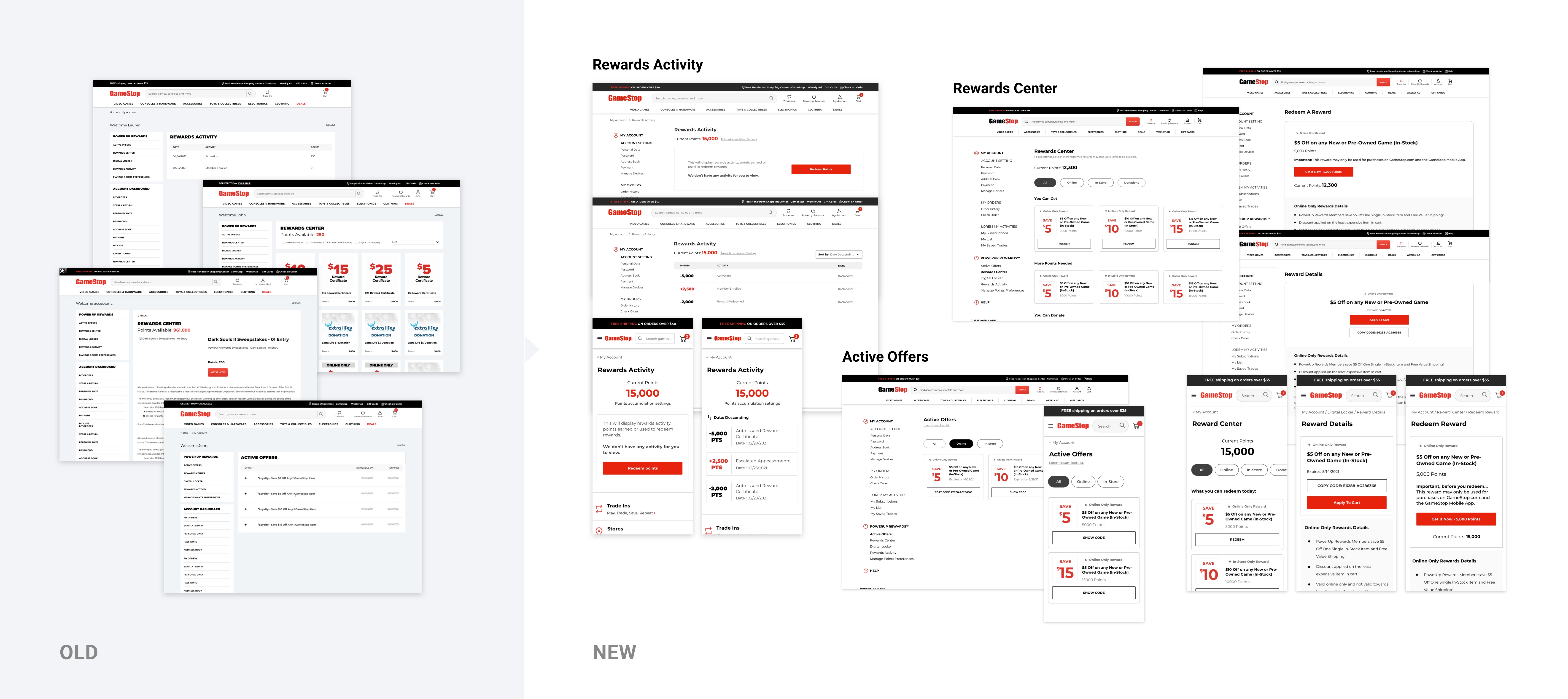
I was also asked to help polish designs for the loyalty program pages, including Rewards Activity, Rewards Center, and Active Offers. Aside from the same visual refresh as the Account pages, we implemented a few key features including a Filter/Sort function, displaying the type of reward (Online-only, in-store only), and the ability to quickly “Copy Code” for offer redemption.
After shipping all these quick-fix designs, we were finally given the go-ahead to explore opportunity areas beyond our initial scope by looking at the experience more holistically. We took this time to work with GameStop to uproot deeper problems and conceptualize design solutions.
I helped deliver a massive site-wide audit of the account creation and loyalty engagement process conducted across GameStop’s mobile web, desktop, and in-store experiences. Part of this audit included collaborating on a service blueprint to document the current flow of front-end and back-end stages of the business.
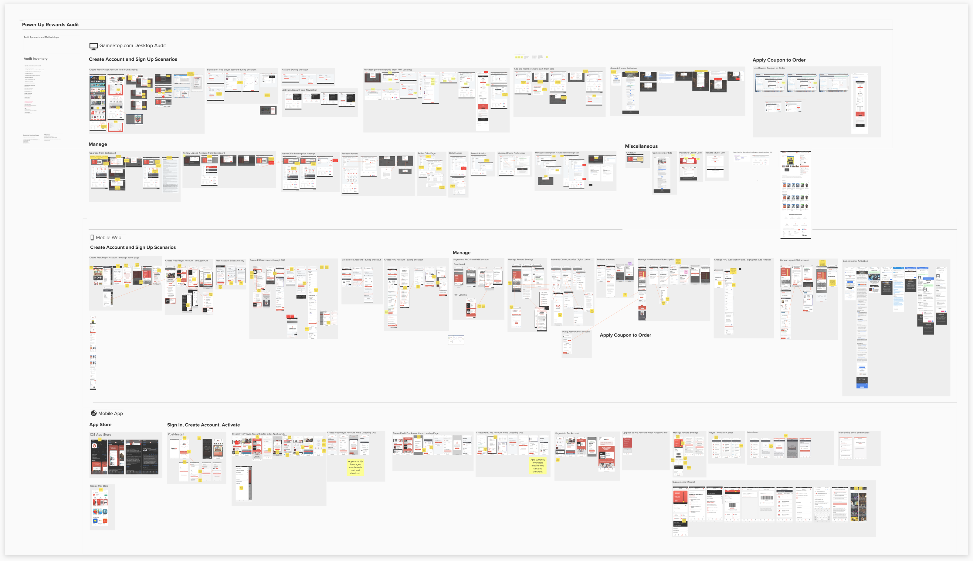
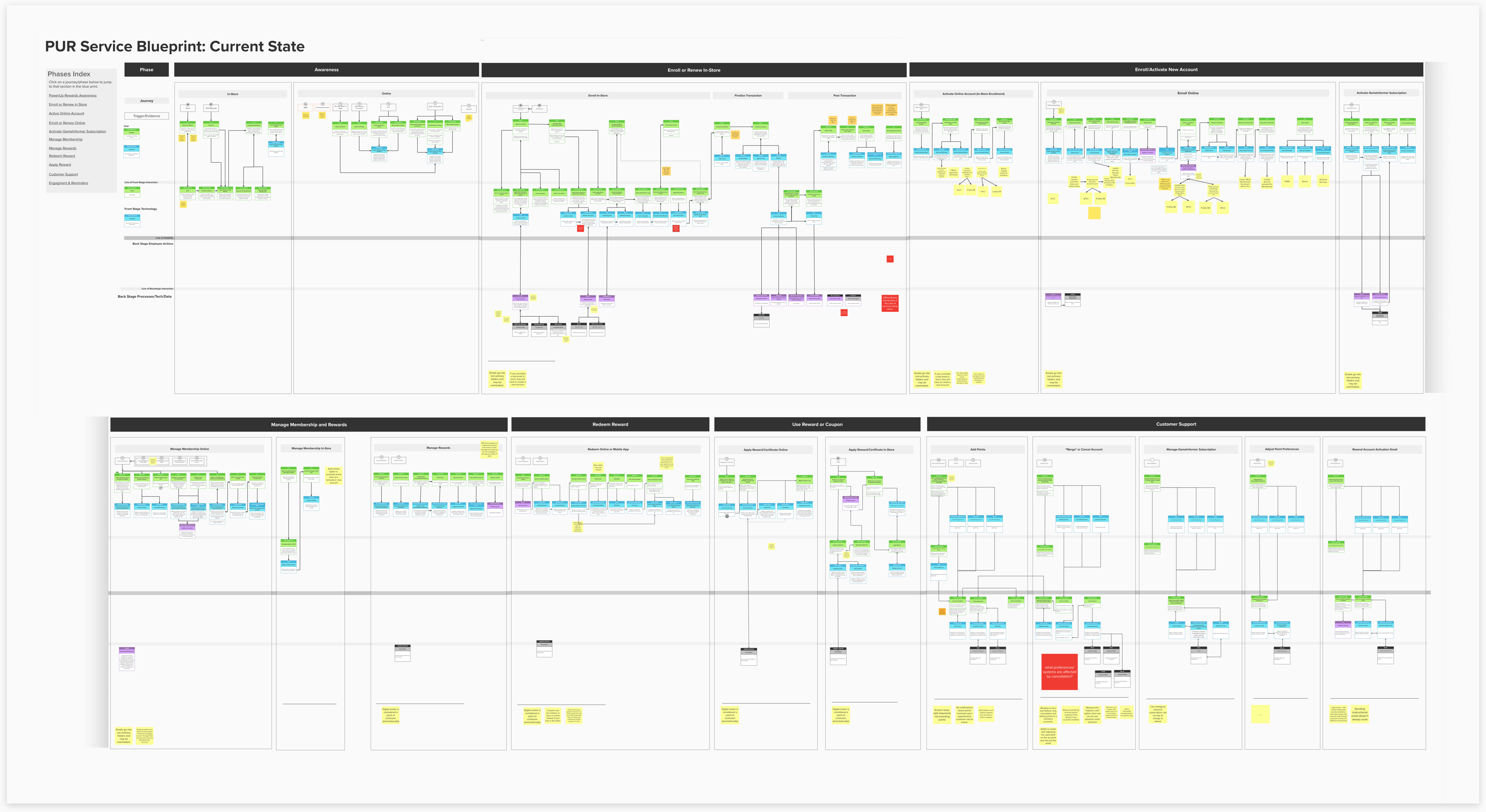
We captured UX/UI issues, development issues, and pinpointed areas of opportunity for GameStop to increase engagement or conversion. We presented our findings and resulting recommendations to GameStop leadership.
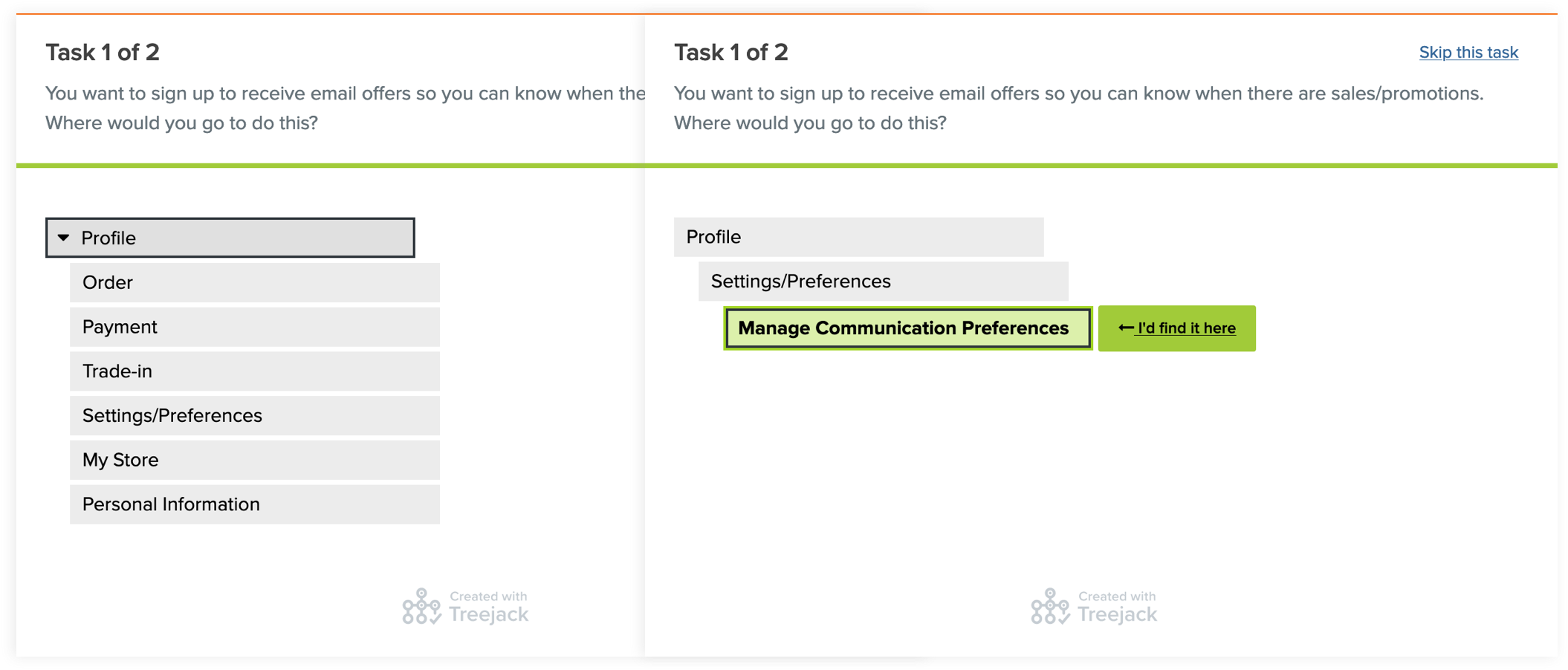
One of the larger problems we tried to tackle was the navigational structure within the account pages. We set up a Treejack study (card sorting exercise) that would help us figure out the best way to redesign the information architecture.
We also used GameStop’s Qualtrics software briefly to monitor specific user sessions, and see how loyalty members interacted with the website while signed into their account. This allowed us to discover UX issues or bottlenecks in the conversion process and understand how users actually went about completing tasks.
Beyond the current e-commerce website, we were involved in creating concepts for how GameStop might introduce a potential e-sports platform to engage new audiences. We did some competitive analysis and drew inspiration from other brands, such as Smash.gg, Macherino, and Pepper. I ended up delivering an e-sports landing page and event page design that played around with visuals, brand image and content.
Later we were also asked to help reimagine a new, sleek look and feel for their mobile app. We were given the freedom to revamp the entire app from the ground up, so we explored everything from new features, to navigational structure and microinteractions. We used mobile apps from Xbox, Best Buy, and Amazon as inspiration. When it came to the high-fidelity designs, my work focused primarily on the account/profile screens and interactions with a digital wallet.
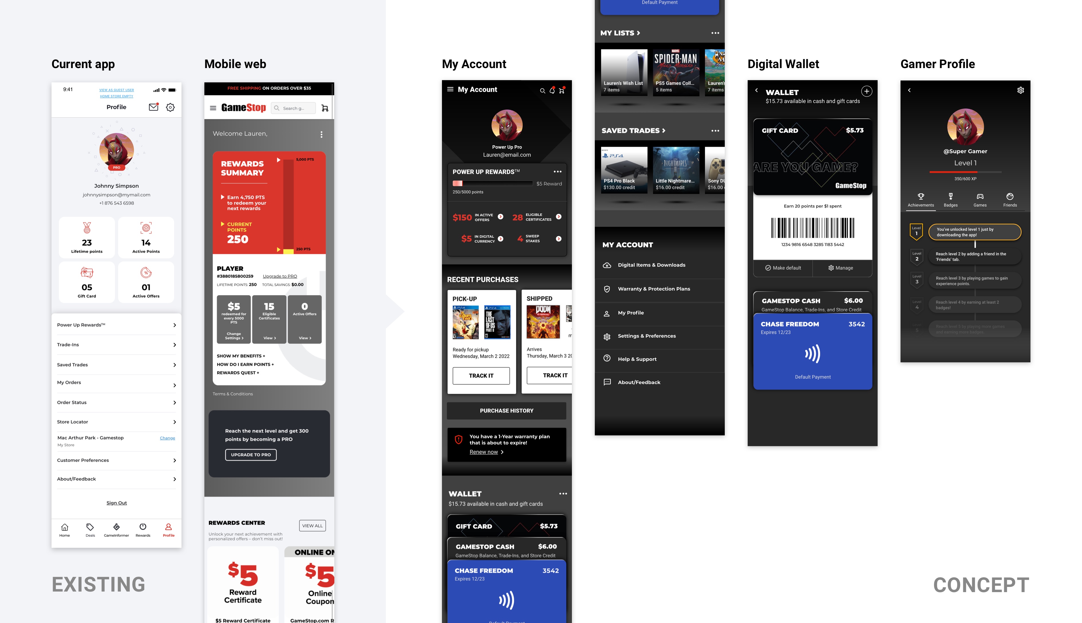
Overall, the work we delivered for GameStop was quite impactful. My account page redesigns (totalling over 60 screens) were shipped and went live soon after handing them off to our developers. I was proud to see how quickly our team was able to put something out for consumers to see, despite the many back and forths we had with the product owners and engineering team.
The audit we delivered helped kickstart a discussion amongst GameStop leadership to revamp their loyalty program and customer engagement strategy. It showed them how much work still needed to be done from more than just a visual UI standpoint. And while our concept designs for e-sports and mobile app were not yet realized by the time I left the project, we received a ton of positive feedback from our client about the work.
Designing for GameStop was a very execution-focused process, with little time to think and much more pressure to produce. My design team worked hard to evangelize UX research, but it was often a struggle to truly incorporate it into our design process. Strategic decisions, like that of tackling quick fixes versus solving deeper problems, seemed to be made much higher up in the organization. Despite our low level of influence in the proverbial pecking order, I learned to really lean into my role as the field expert and consultant - handling client objections, vouching for the user, and advising on UX strategy as best we could, in the hopes that we could spark greater discussion about more transformative efforts in the future.
Throughout the project, I was witness to a constant churn of people and change of executive leadership. And with this change in leadership often came a change of vision and direction, which of course impacted the day-to-day flow of our design work. It required us to stay on our toes, to be flexible and highly adaptable in such a dynamic environment. It also taught me not to get too attached to my designs!
We collaborated with GameStop’s internal design team to ensure that the website redesigns matched the most recent version of their digital rebranding effort, which included updates to their design system. The challenge was that the design system was constantly evolving, with the rebranding work being done concurrently to our work. There was a lot of back and forth communication required in order to get everyone aligned on the same page. I learned how to work fast and efficiently in an agile process, but also how to communicate effectively and accurately with multiple players, including developers, product managers and other designers.