myUHN
Enabling access to personal health information for a better patient experience
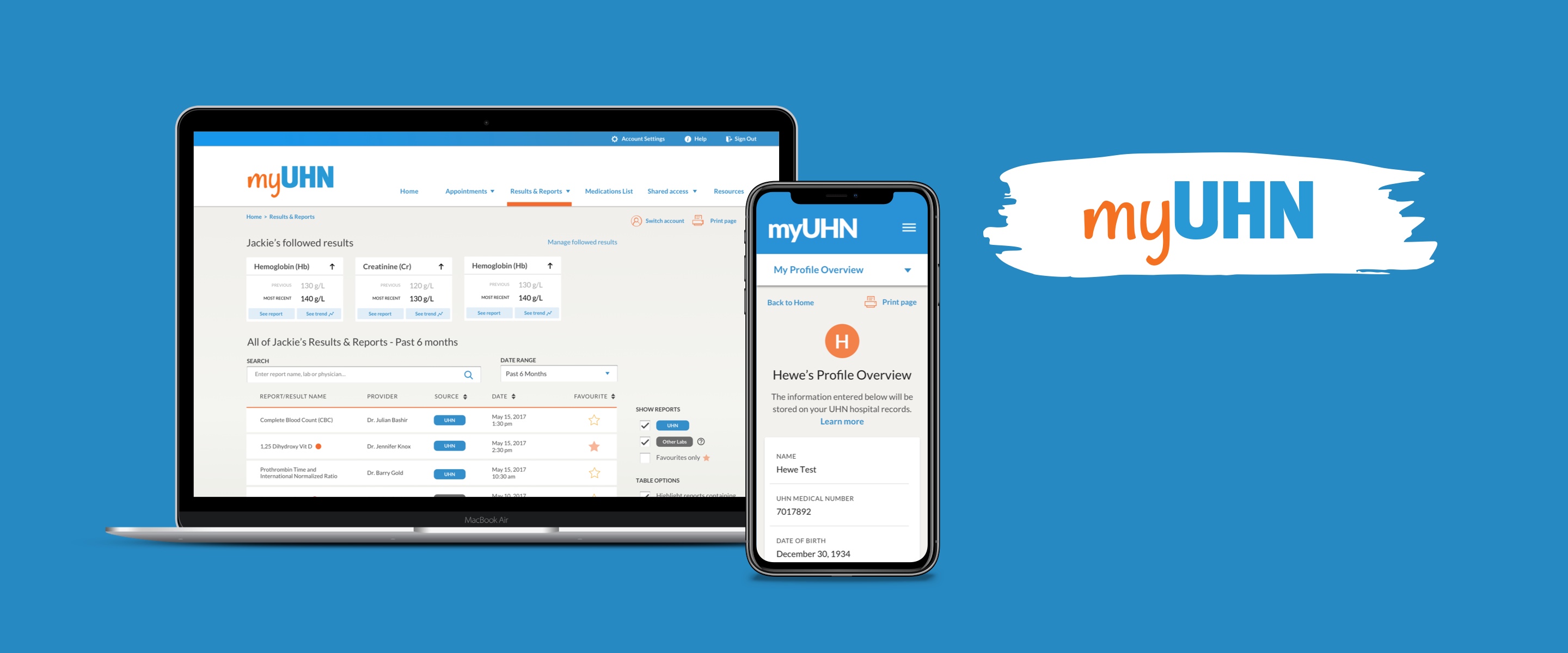

I had the great pleasure of working at Healthcare Human Factors (HHF) as a Human Factors Intern, as part of a 12-month long co-op program. During my time at HHF I was able to work on projects ranging from physical/digital interface design to patient safety systems and service design.
One project I learned the most from was working on the user interface for myUHN Patient Portal, an online website application used by thousands of patients at the University Health Network (UHN) in Toronto to view and access their personal health information online. You can check it out here.
Human Factors Design Intern
May 2018 - Nov 2018
Sketch, InVision
Albert Jin, Odelia Lee, Lauren Ip (me!)
A patient's journey through the public healthcare system in Ontario is not a simple nor very pleasant one. Plagued with delays, disorganization, and lack of communication from health care providers, the process for getting a simple lab test result back can be a major headache. For chronic patients especially, it is more than just an "inconvenience" and can hugely impact how they are able to navigate, understand, and manage their own health.
While the current patient portal solved a small part of this problem for clinical visits done at UHN, many patients also got laboratory tests done outside of UHN, and were frustrated with having to keep track of results coming from many different places. Our challenge was to expand the patient portal to accommodate for this need.
The basic intent of the new design was to allow patients to access results from other private medical laboratories across the province, in addition to UHN. Patients would be able to see all their results in one place, without having to chase each one down individually. However, we realized that this wasn't only a matter of convenience and accessibility, but also one of empowerment. We saw this as an opportunity to use the newly integrated data as a starting point for self-management, to provide patients with the tools they needed in order to feel in charge of their own healthcare. So we created an experience that would feel informative, supportive, and as transparent as possible.
I worked with 2 designers to carry out user research activities during the discovery phase, including user interviews, workshop facilitation, and data synthesis. During the design phase I worked on several key pages of the patient portal, starting from the initial wireframes to higher-fidelity mockups and visual design.
Co-design—a creative process based on the collaboration between us and our stakeholders to generate ideas and design concepts—was at the core of this project. While design decisions were grounded in insights garnered from user interviews, surveys, literature reviews and secondary data analysis, I believe that getting end users to actively participate in our design sessions was key to understanding the true needs of the project.
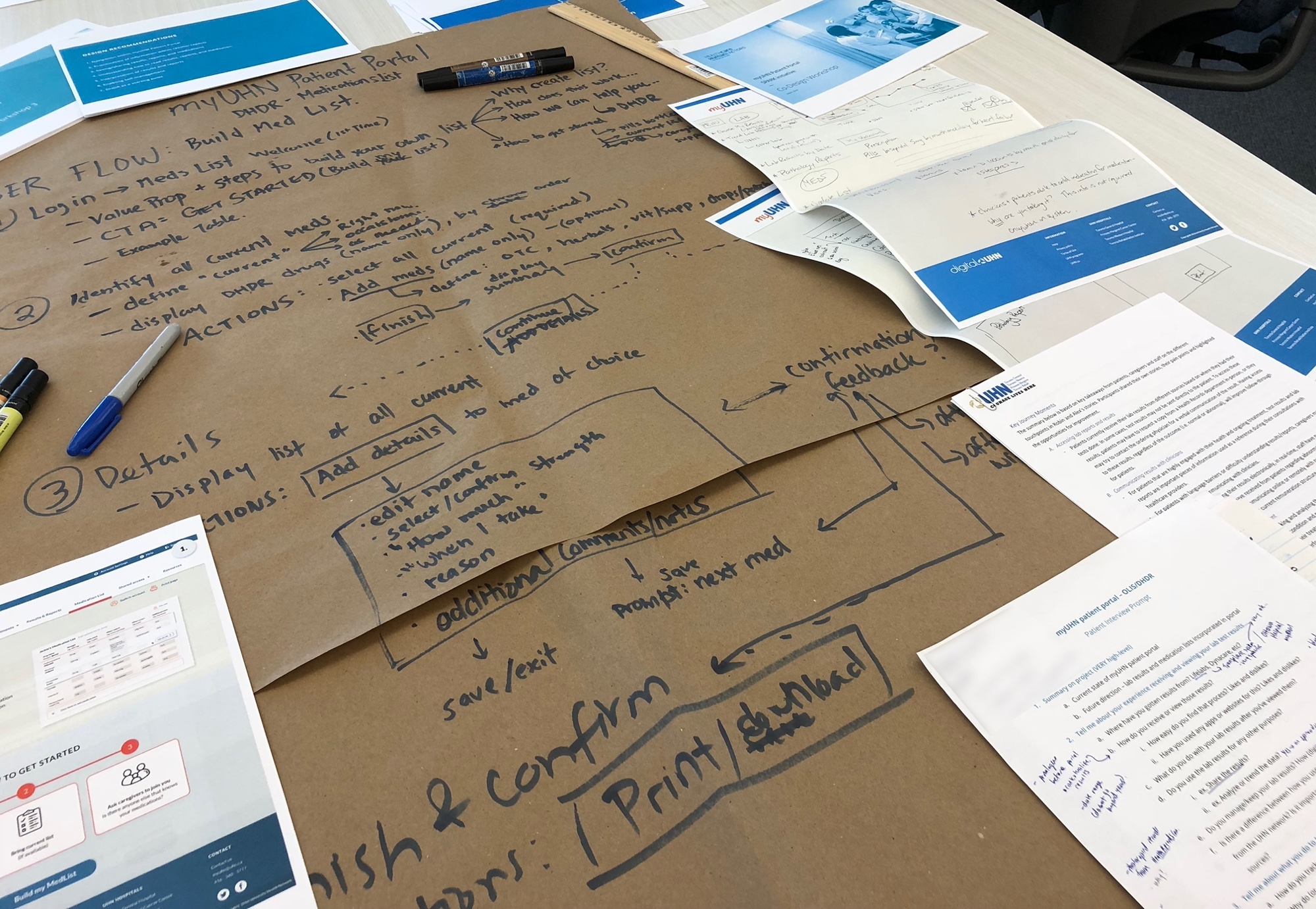
We held monthly interactive co-design workshops where we would review our designs with real patients, then make design changes based on the feedback received. Each workshop was an opportunity for us to test out new ideas and refine our design direction moving forward. We aimed to keep users engaged and involved in the design process as much as possible. This iterative, user-centered approach allowed us to develop the site from what would have been an informational ‘data dump’ to something much more valuable for patients.
We started off by doing some background research into current patient portals available in the market for patients to access their lab test reports and results, both private and public. We worked alongside the UHN Digital team to gather user requirements throughout the design process, and held a couple of one-on-one user interviews to get a basic understanding of what the common pain points were for patients at UHN. We asked questions like:
“What problems do you currently face when dealing with lab test results and reports?"
"What does current myUHN Portal do well, and where does it fail?"
“How would your ‘dream portal’ address some of your current challenges?"
Based on these interviews we drew up 2 personas—Robin and Alex—each with a compelling story that captured different aspects of the patient experience. Robin's journey represented patients who have had an acute illness or incident, and their experiences with point-of-care communication (i.e. interactions with clinicians) throughout. Alex's journey represented those with chronic conditions, who were more concerned with the self-management of lab test results.
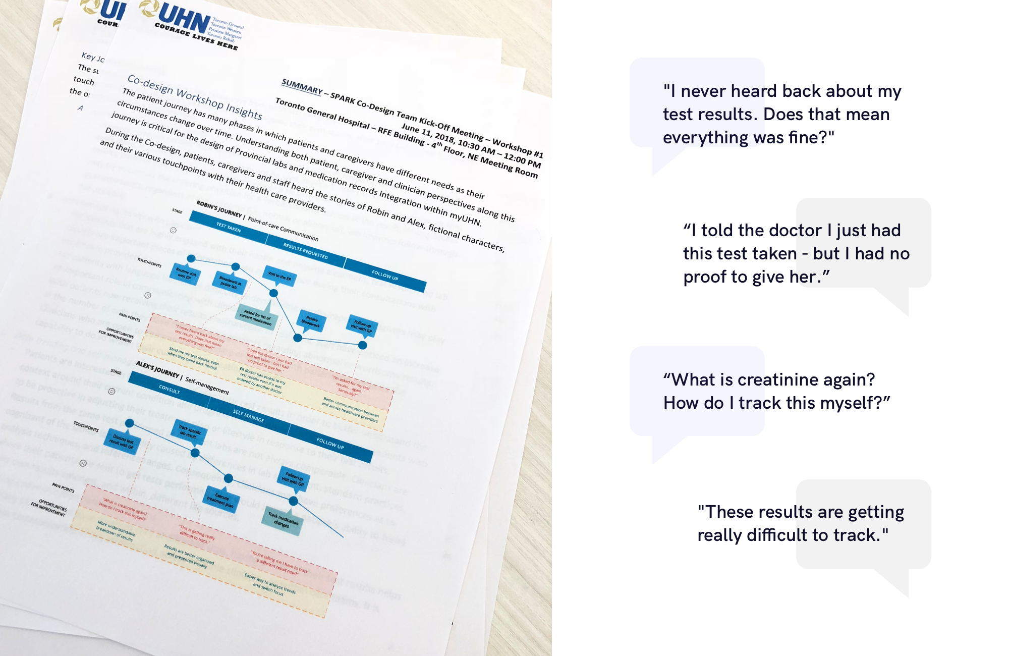
We had 6-8 users and 3-4 stakeholders attend our first workshop, which was focused on understanding the context surrounding patients’ pain points. We moved through a journey mapping activity with our users, in which we encouraged them to tell us their personal stories in a "campfire storytelling" format. We drew inspiration from the handy playbook Gamestorming (by David Gray, Sunni Brown & James Macanufo) and IDEO's Design Kit to carefully craft, prepare and facilitate the activities in our workshop.
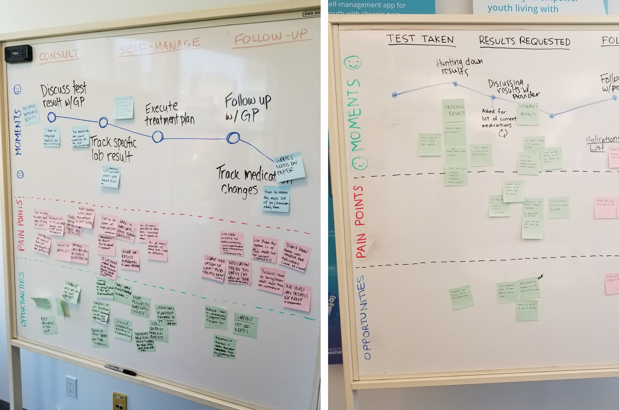
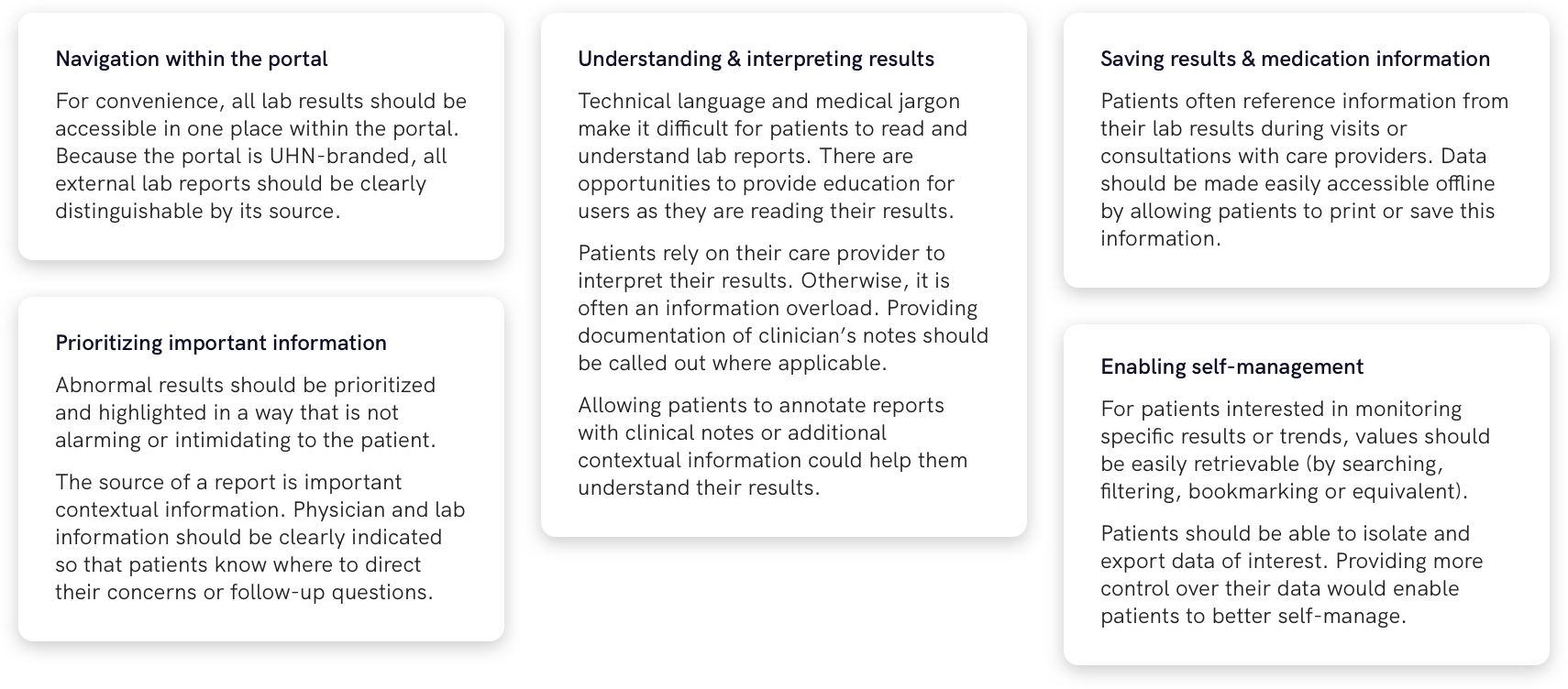
After the workshop we synthesized the research into key insights and recommendations, which outlined common concerns from our users and categorized them into several main aspects of the patient experience. This was shared with our stakeholders and used as our guiding "north star" as we moved into the first stages of design.
Our team did a ton of individual and group brainstorming, making it through several iterations before landing on a design draft that we were happy to move forward with.
In our second workshop, we thought we would try user sketching, a brainstorming activity where patients could sketch out their own ideas on paper. This way, we could see what users imagined their ideal patient portal to be in a "blue sky" scenario, and take note of elements that they thought were most important to include. We also prepared our own design to see if any of our ideas aligned with those of our users. We then did an interactive design review where we showed key aspects of our design to users and asked for feedback.
While we received great feedback from patients, we wanted to ensure that the design would hold up against the values and standards of our stakeholders. We consulted subject matter experts (SMEs), department heads/managers and patient caregivers to get expert opinion on more detailed medical aspects of the design, as well as discuss patient safety and risk considerations including:
From these focused discussions we were able to extract valuable insights and recommendations to better inform our designs from a medical point of view.
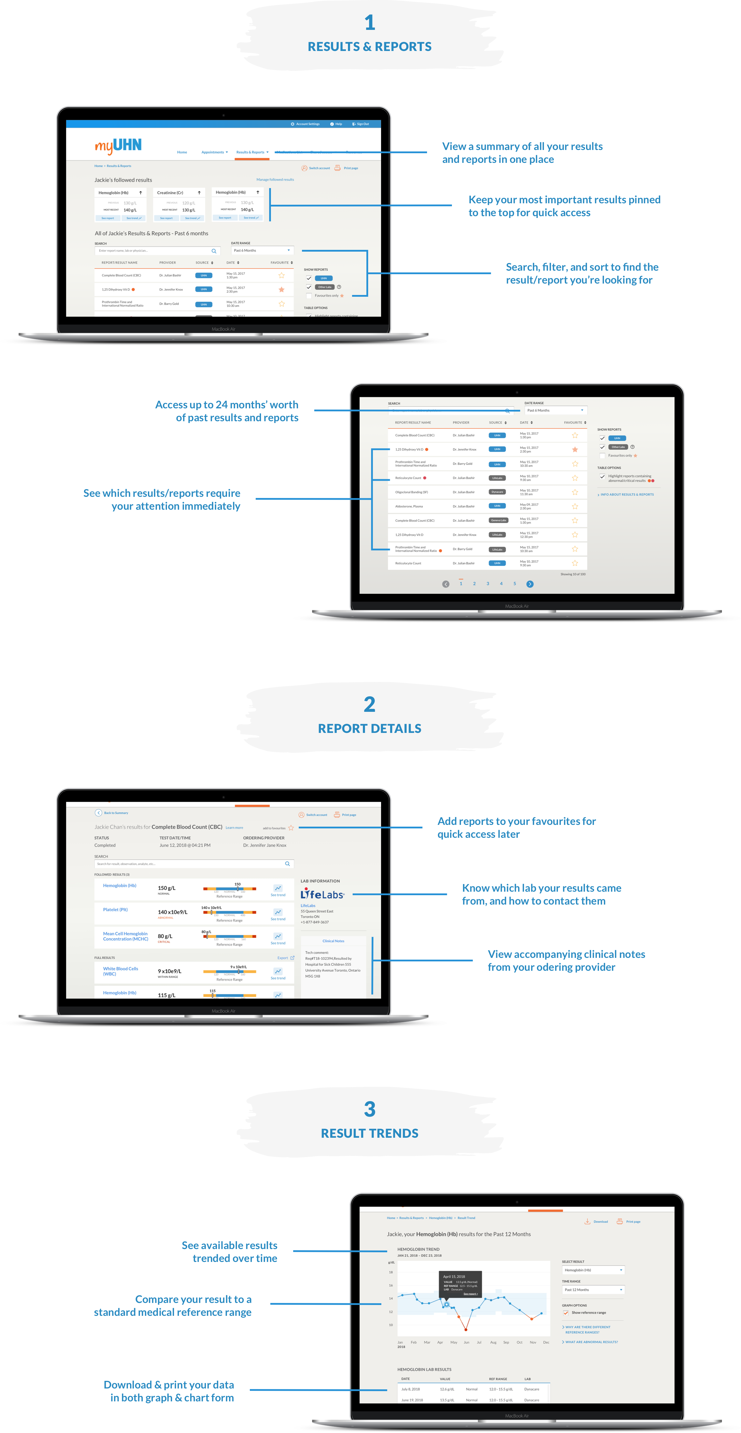
With lots of feedback, insights and recommendations to work from, we continued to iterate and refine our designs. We worked on three main pages which defined the primary user flow: 1) Results & Reports Summary, 2) Report Details, and finally 3) Result Trend. For each screen we designed for different states (e.g. empty / error / default), interactions (e.g. hover / click / transition), and edge cases, however these are not shown below.
Our last workshop focused on validating our latest design iteration, after having incorporated multiple rounds of feedback from previous meetings with SMEs as well as the last workshop.
We linked each key element of the design back to the insights and recommendations we had gathered from both patients and clinicians. We wanted to show that our design decisions were based off real data collected from our users and stakeholders.
My team continued to iterate on the design after I left the project. While I was unable to see the final implementation through to its end, I felt proud of what our design was able to accomplish while I was still there:
One of the most challenging constraints was having to work within UHN’s legacy systems and their server's inability to handle large amounts of data. With over 50,000 users registered to the UHN patient portal, some features (largely related to processing queries and storing user input) were just not possible to scale—for example, allowing patients to view their entire history of results beyond the last 24 months, or allowing users to save their own report annotations.
Because of these limitations, we were forced to think about the necessity of certain features and the impact it might have on overall patient experience. We had to explore alternative solutions to features that were deemed necessary, while keeping in mind the scalability and adaptability of our designs for future phases of the project.
At the end of my internship, I left with some key takeaways and lessons learned from this project: